
The Digital Control Centre
for the NHS, with Hitachi Vantara
Improving care with data; delivering a digital tool to help the manage hospital capacity during the pandemic and beyond.

Background
Improving care with data
Salford Royal NHS Foundational Trust (SFRT) commissioned a digital tool to transform the hospital’s operations and ‘improve care with data’ in a 10-year, £25 million partnership deal. Learn more here.
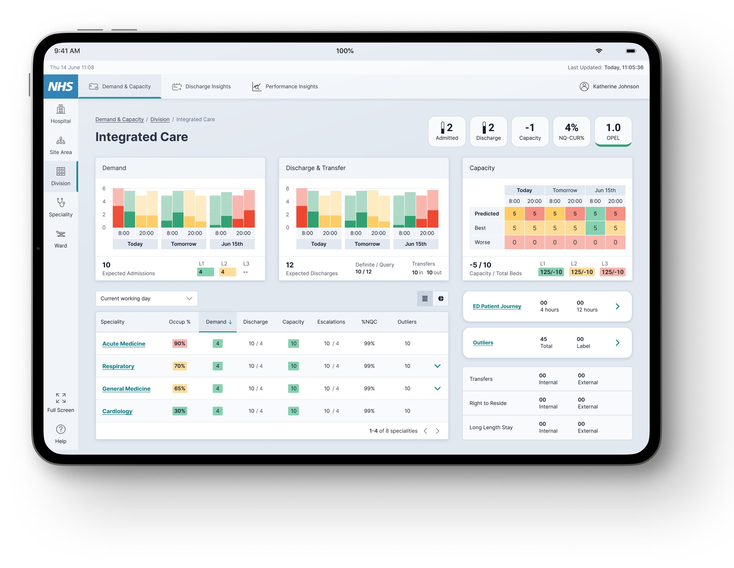
I worked on the Demand & Capacity workstream, a platform designed to give clinicians and operational staff a real-time view of hospital capacity and support faster, more informed decision-making.
Role; Product Designer, working with a Product Owner, Service Designer, UI designer and engineering team.
Result; The MVP was delivered to Salford Royal in November 2020, supporting capacity management through peak Covid and flu demand.
Demand & Capacity
Performance Insights
Discharge Insights
Process
The Challenge
Covid-19 and unprecedented disruption to BAU.
Before starting the project Hitachi had mapped all of the relevant user journeys through extensive ethnographic research.
However, by the project’s start in March 2020, the pandemic had caused unprecedented disruption to the hospital’s ‘business as usual’.
The biggest challenge became understanding what was changing inside the hospital and reframing these insights to fit into the hospital’s new and evolving procedures.
The Solution
Concept refinement through iterative processes
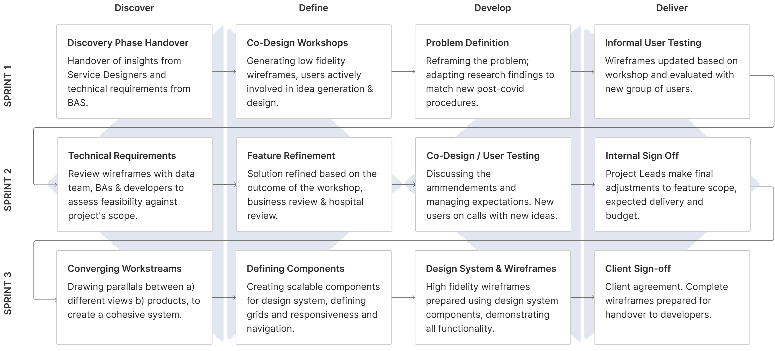
Alongside the PO, we created a new project plan, structured in tight sprint cycles.
The process relied on rapid prototyping and continuous usability testing to accelerate decision-making and product refinement, ensuring that the MVP aligned with core user needs.
Discovery
Gathering and reframing requirements
I kicked off the project by reframing the existing research insights to fit into the hospital’s new and evolving procedures. To do so, I conducted interviews over Microsoft Teams with key stakeholders and available members of staff.
Business Objectives - reduce backlogs and relieve pressure on A&E
…by supporting staff decision-making in real-time, through coordination, insights, and analytics relating to free beds and equipment.
Support decision-making - through coordination, insights, and analytics.
Operational planning and scheduling - identify demand and capacity and plan patient flow through the system.
Facilitate care delivery - manage and deliver the care plan, updating on progress in real-time.
User Goals - right person, right insight, right time
Designing for flexibility; based on early insights from the research team, the platform needed to balance the needs of patient-facing vs operational & strategic users.
As an introductory session with users, I asked participants to map realistic scenarios of how they expected D&C to support them in their everyday tasks. This helped me to frame the crucial interaction moments;
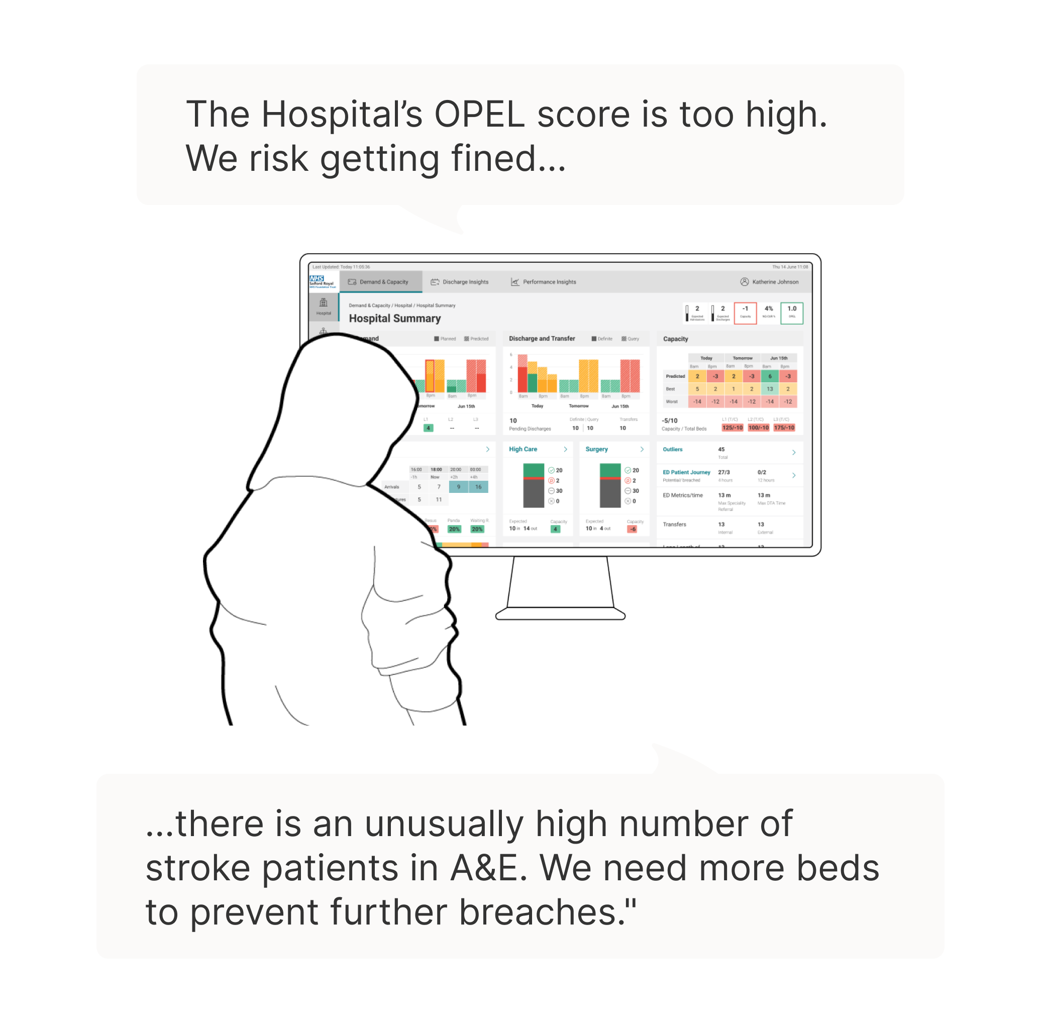
Operational & Strategic Users
‘I want to be able to identify where there are improvement needs so that I can identify root causes and interventions to improve.’
Operational & Strategic Users will be viewing the DCC on a desktop screen in an office and will prioritise detail and availability of information.
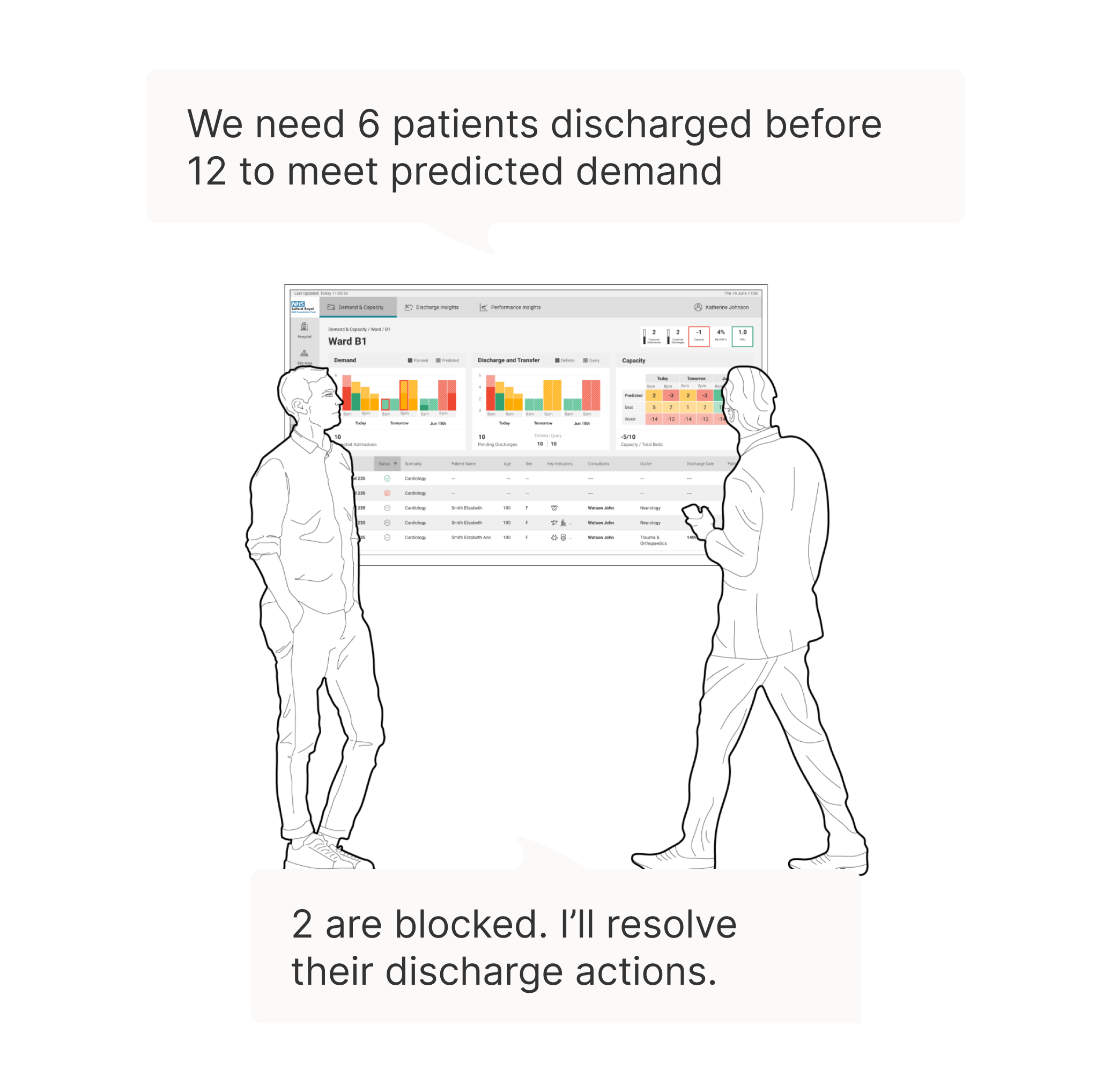
Patient Facing Users
‘I want accurate information that I can use to inform my decision making.’
Patient-facing users include clinicians, nursing staff, porters, and the transport team. They are viewing the DCC on a TV screen in their ward, and prioritise fast, ‘right first-time’ interpretations of the data on display.
Defining the Solution
Ensuring empathy-driven design
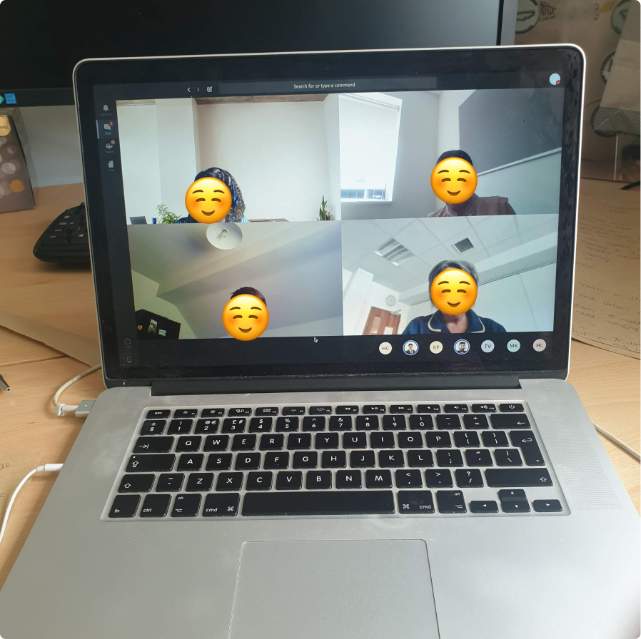
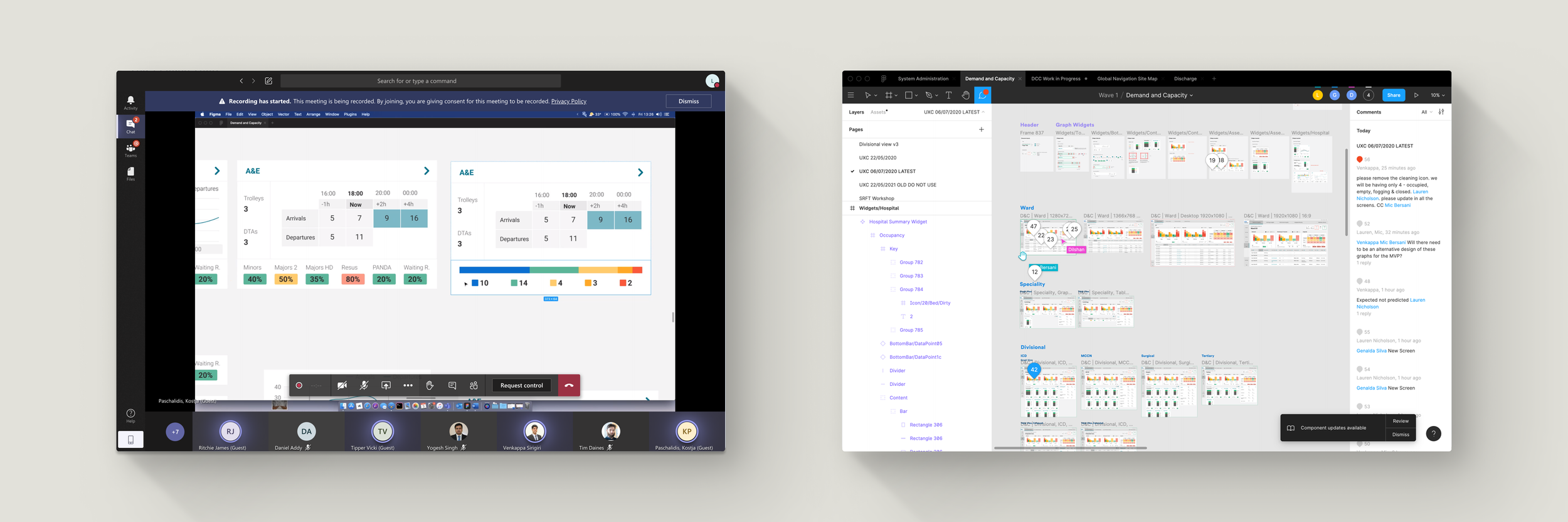
Continuous user involvement - remote workshops with users became critical for,
Knowledge sharing, understanding what was changing inside the hospital.
Identifying the essential user journeys.
Gaining access to the users for usability testing.
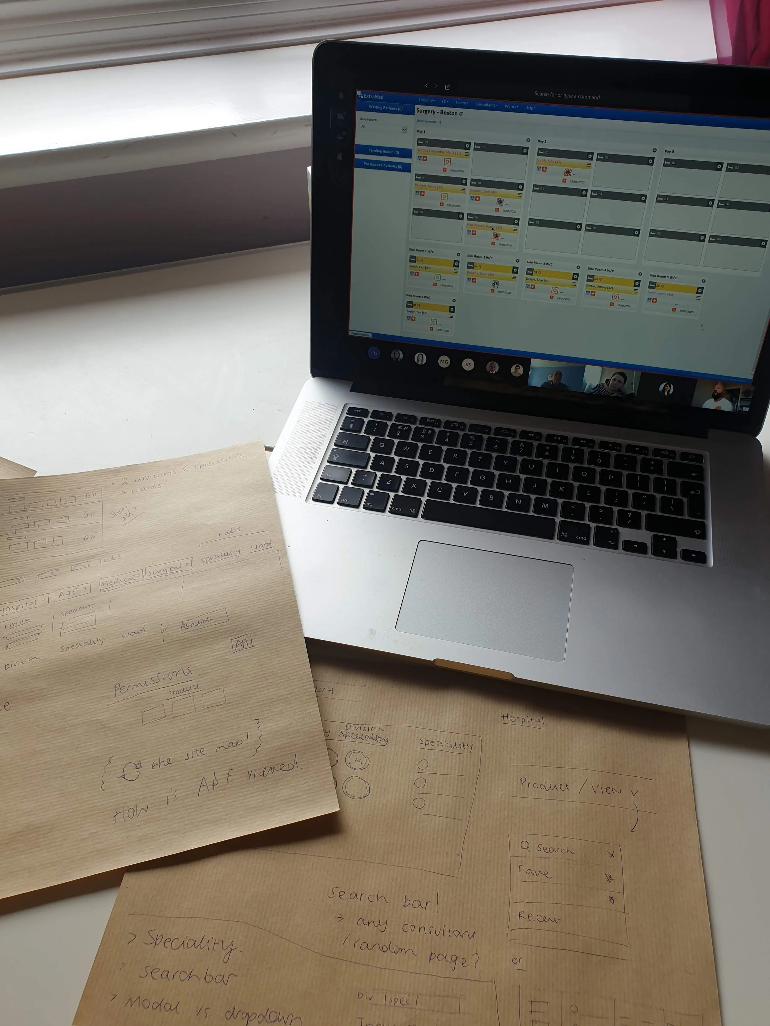
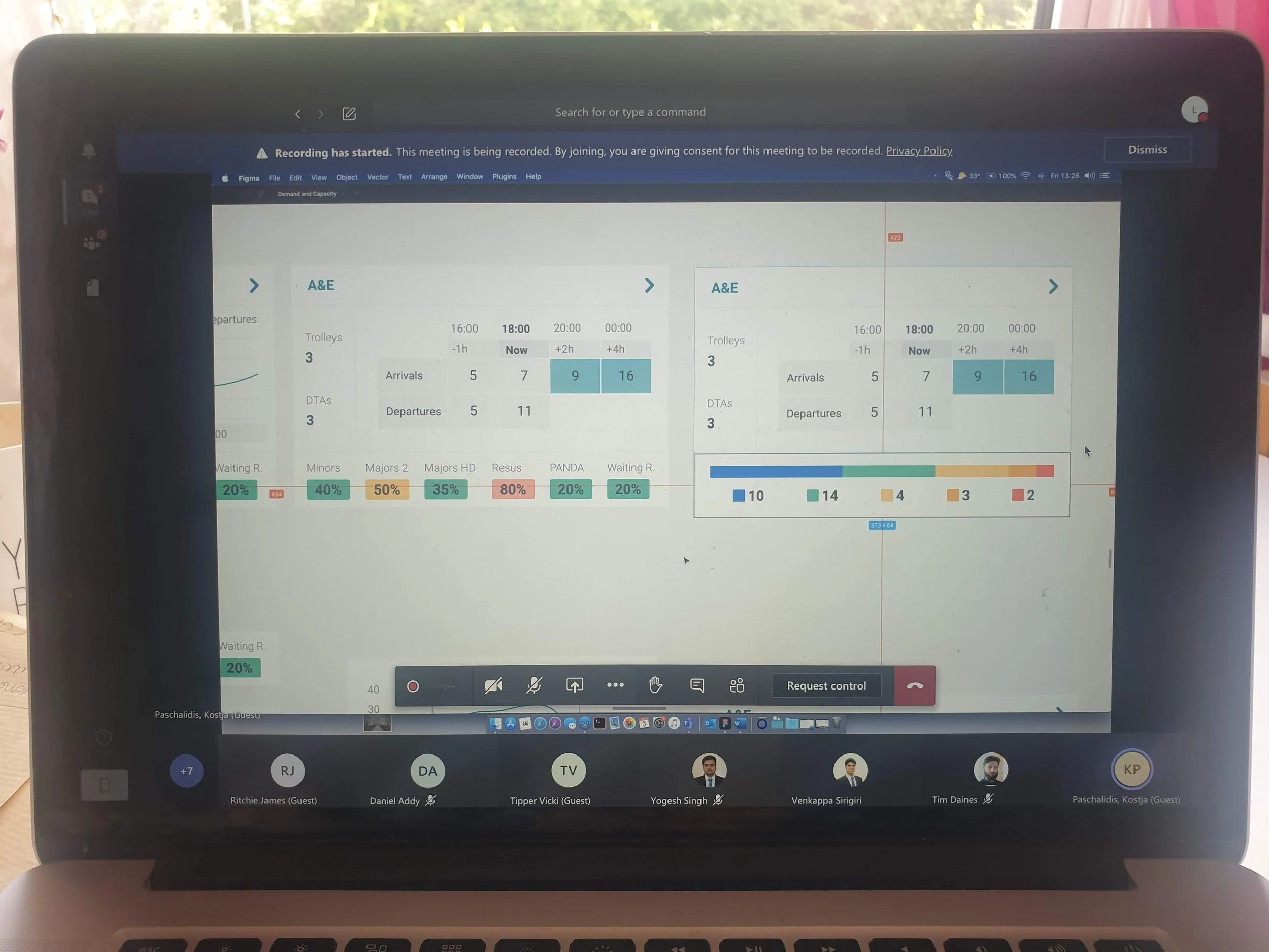
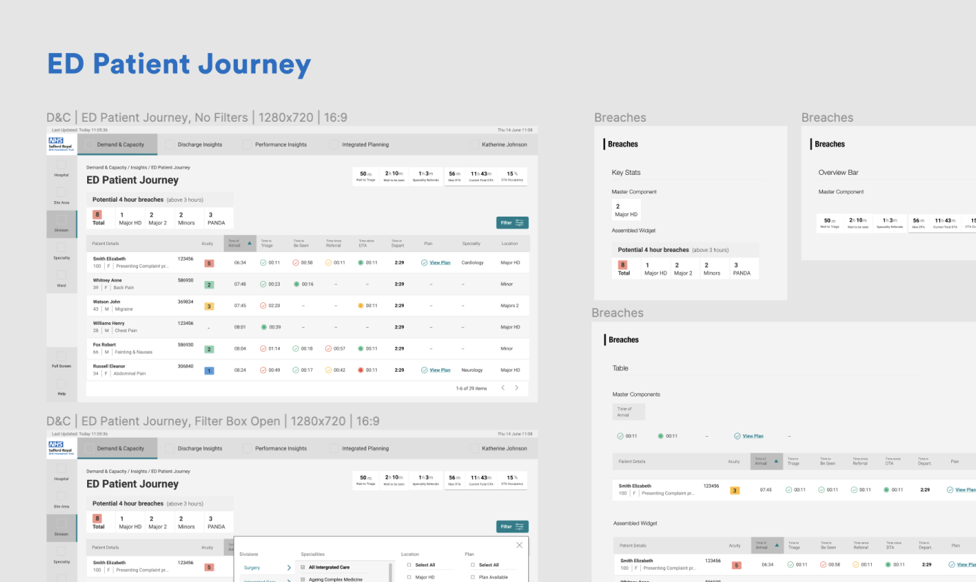
Quick and rough wireframes were created in virtual workshops and were helpful in quickly exposing user’s expectations and thinking. Further through the programme the wireframes were developed into rapid prototypes, to gather more detailed feedback from users.
Ensuring technical feasibility
Cross disciplinary technical reviews - to set the project up for success, developers were involved at every stage of the project.
A collaborative approach significantly enhanced the success of the project, by ensuring that proposed features and timelines were feasible and realistic. Figma allowed for collaborative working outside of meetings.
The design team (across the DCC work streams) also held weekly meetings, to agree on ‘widget’ patterns, page layouts, etc. to ensure the user’s overall experience would be cohesive as they moved between the three products.
Information Architecture
Site hierarchy that mimics the hospitals organisational structure
All three UX designers collaborated to develop a site map, outlining our recommendations for the hierarchy of pages and the implementation of navigational elements.
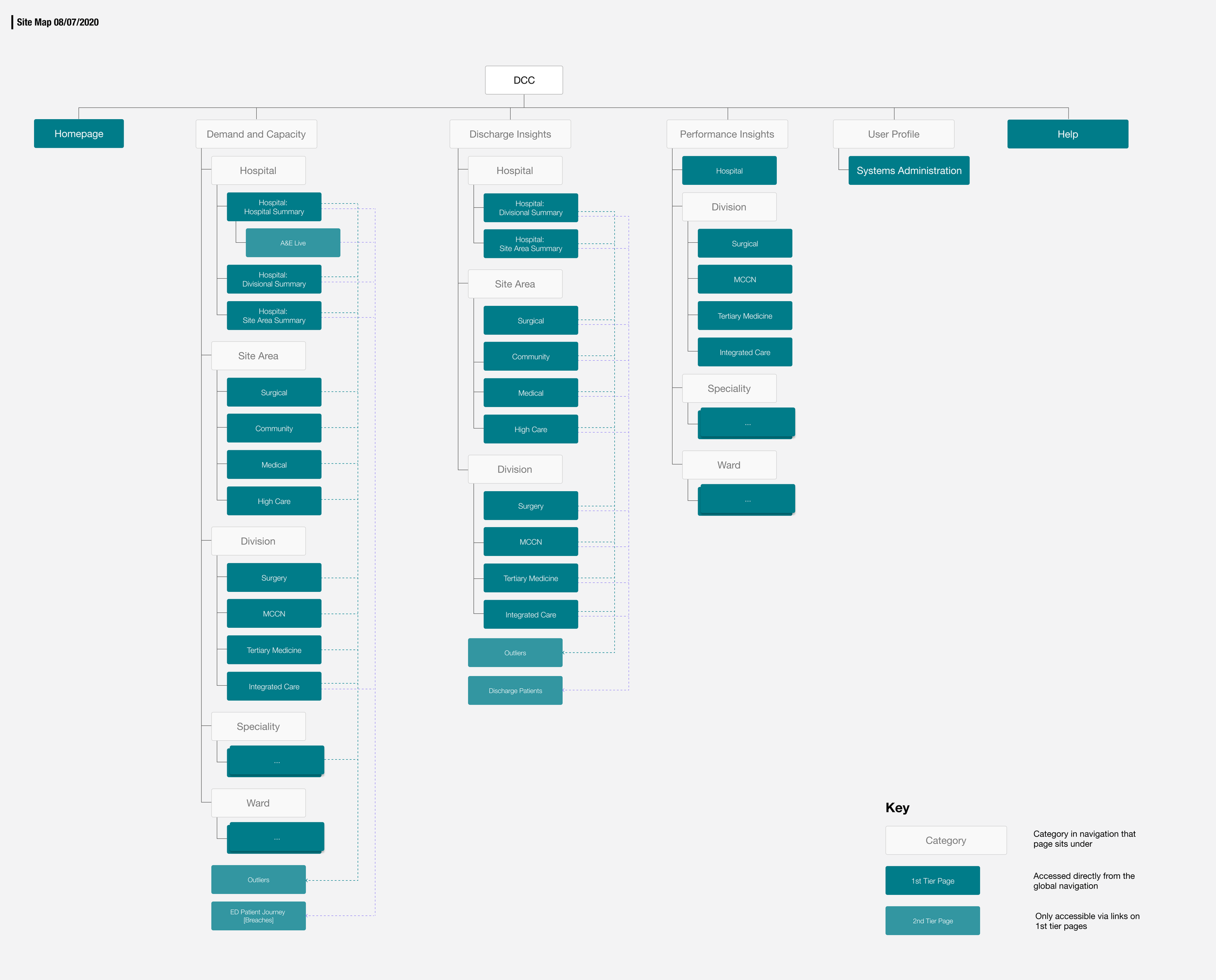
The site hierarchy was designed to mirror the hospital's organisational structure. This approach facilitated the management of permissions for each level within the hospital, allowing senior management to drill down into detailed data while ensuring that ground-level staff could only access information pertinent to their daily tasks.
Navigation that works across contexts
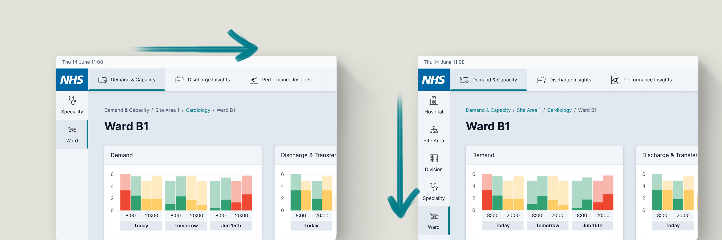
The global navigation was designed to be consistent and user-friendly, and used to orientate the user. Importantly, the breadcrumb navigation would allow users to easily track their location within the site and backtrack if necessary.
The user works in cardiology (left) - they can only see the screens for cardiology and the wards within cardiology. The user moves ‘horizontally’ between products, the platform retaining the user’s position in the hierarchy as they do so.
The user works in top-level of the hospital (right)- having identified a problem with capacity at the highest level, they have drilled down to ward level (moving ‘vertically’) to diagnose the issue.

Design Outcome
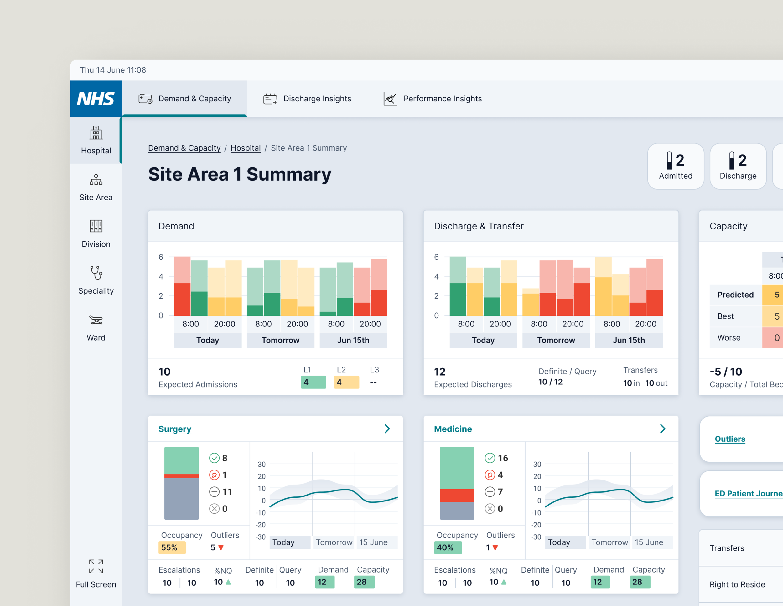
Supporting decision making by automating workload
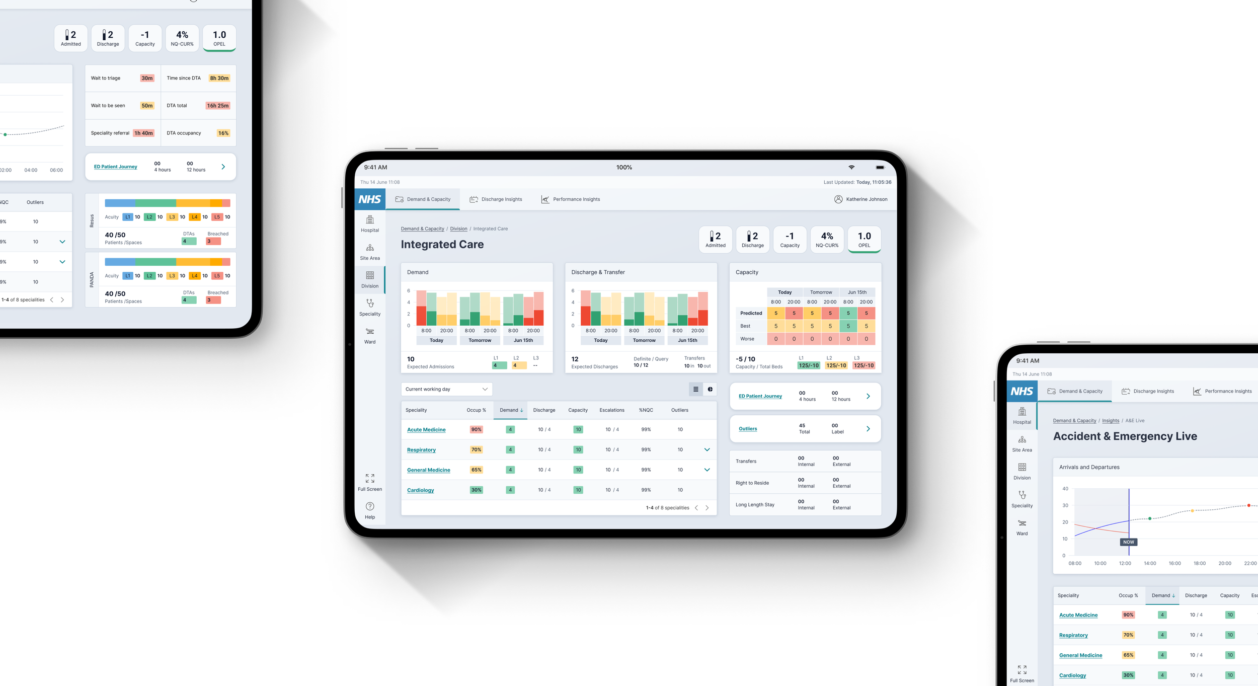
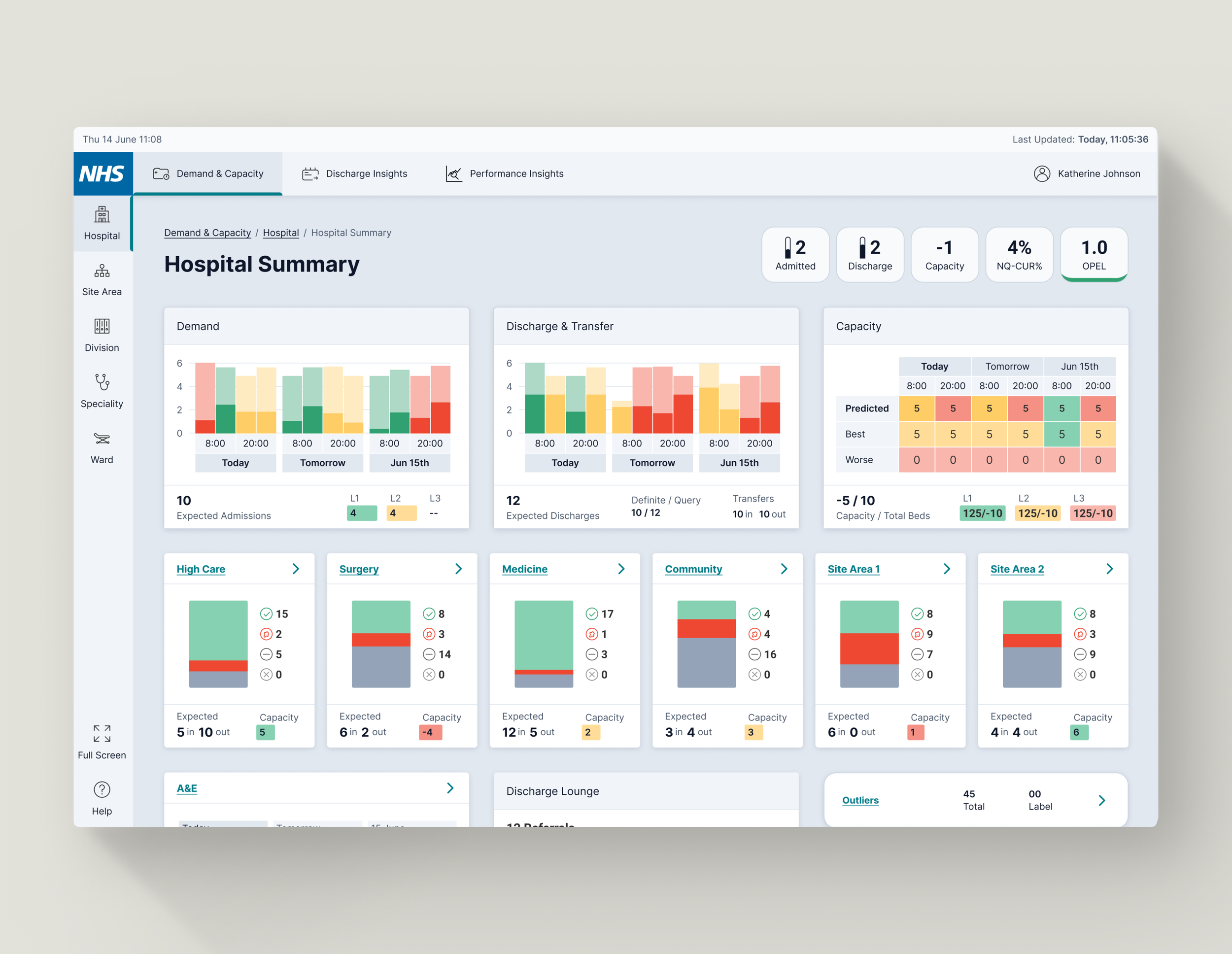
Consistent 'bottom bar' on widgets. Reduces cognitive load by bringing together lower-level data into higher-level summations.
Relevant information is grouped on the interface. These groupings are consistent across the screens, further reducing cognitive load.
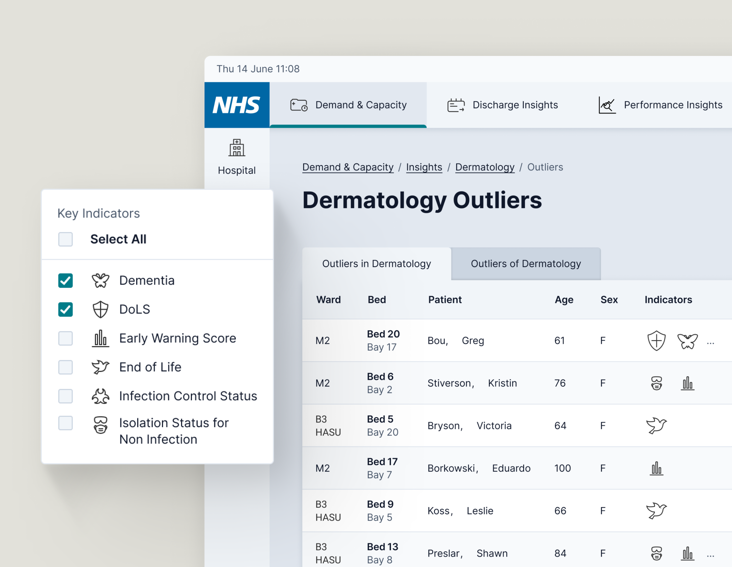
Match between the system and the user’s environment
The interface uses consistent UI elements and abbreviations that currently exist in the hospital and on the hospital’s other software.
This consistency eases the user’s transition between the real world, other software, and the DCC.
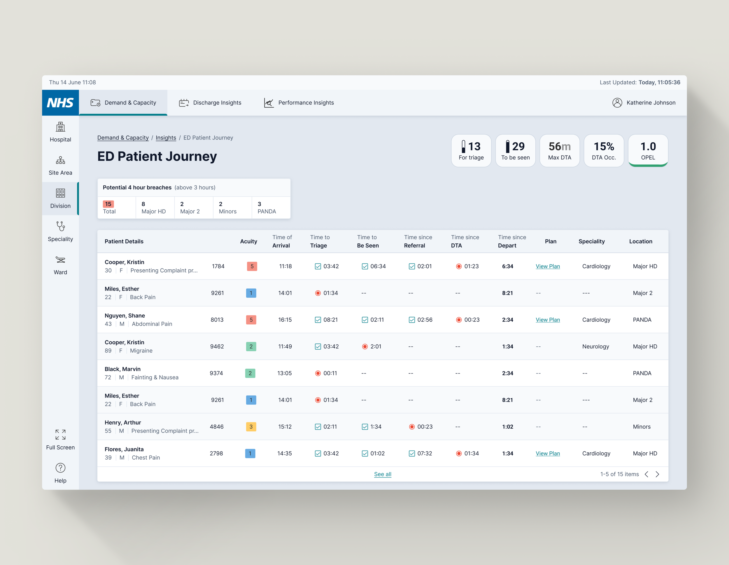
Visibility of system status
Every screen displays the current date and time to give users confidence that they have up-to-date information to facilitate time-sensitive decision making.
The system automatically refreshes every minute to provide the latest data on patient counts, bed availability, and staffing levels.
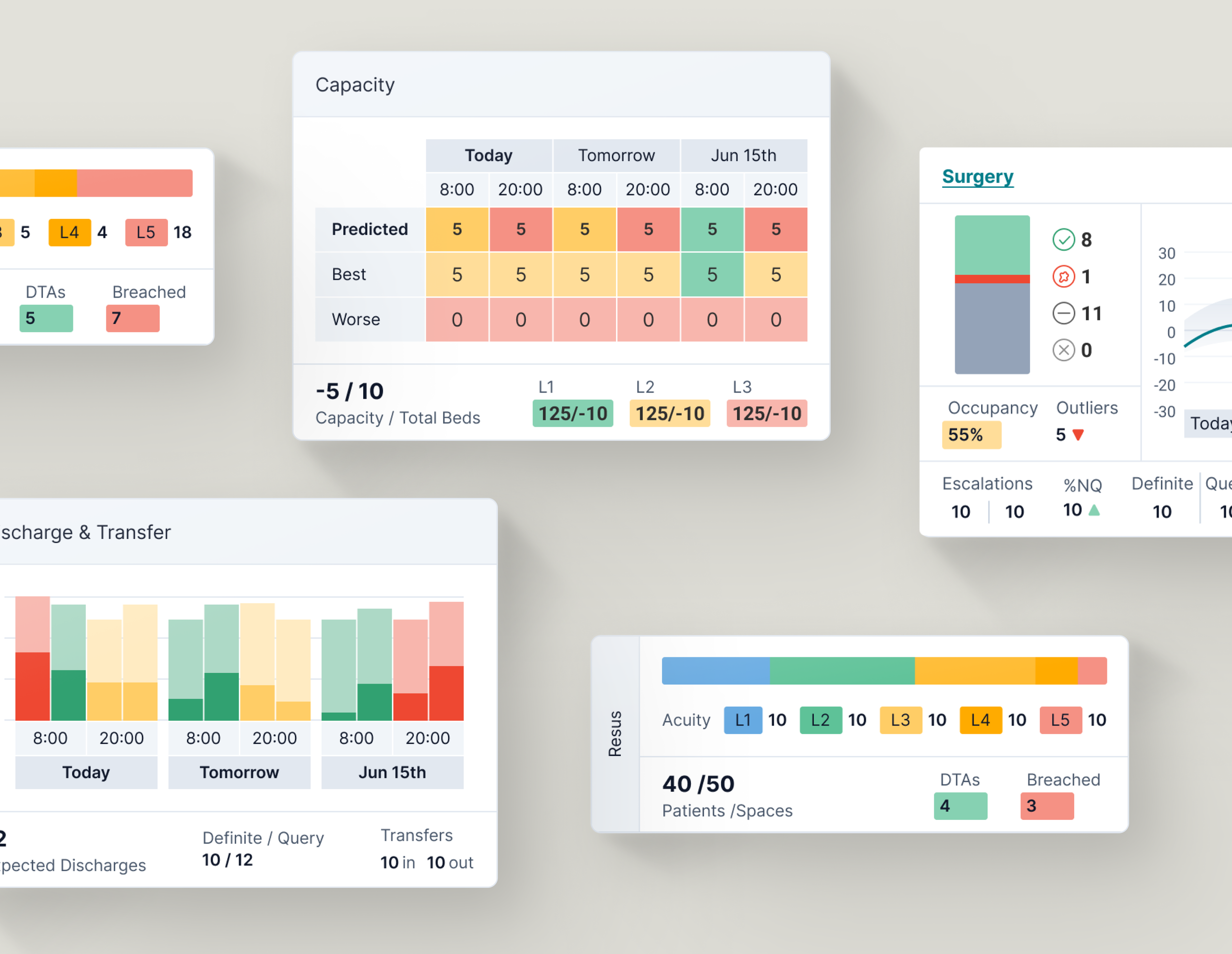
Designing for flexibility
The dashboard is built with a collection of reusable widget components that can be configured to create unlimited dashboards tailored to the needs of each use case.
It can be scaled for ward use or for individual users, providing meaningful insights in the given context. Widget groupings are used consistently across screens to aid cognition.
Familiar frameworks reduce cognitive load
User testing focused on the principle of ‘judicious redundancy.’
At the highest hospital level, some statistics might lack the specificity needed for effective decision-making.
However, maintaining the position of these widgets at the highest level ensures consistency and aids users as they navigate between pages.
UI & Documentation
Accessibility at the forefront
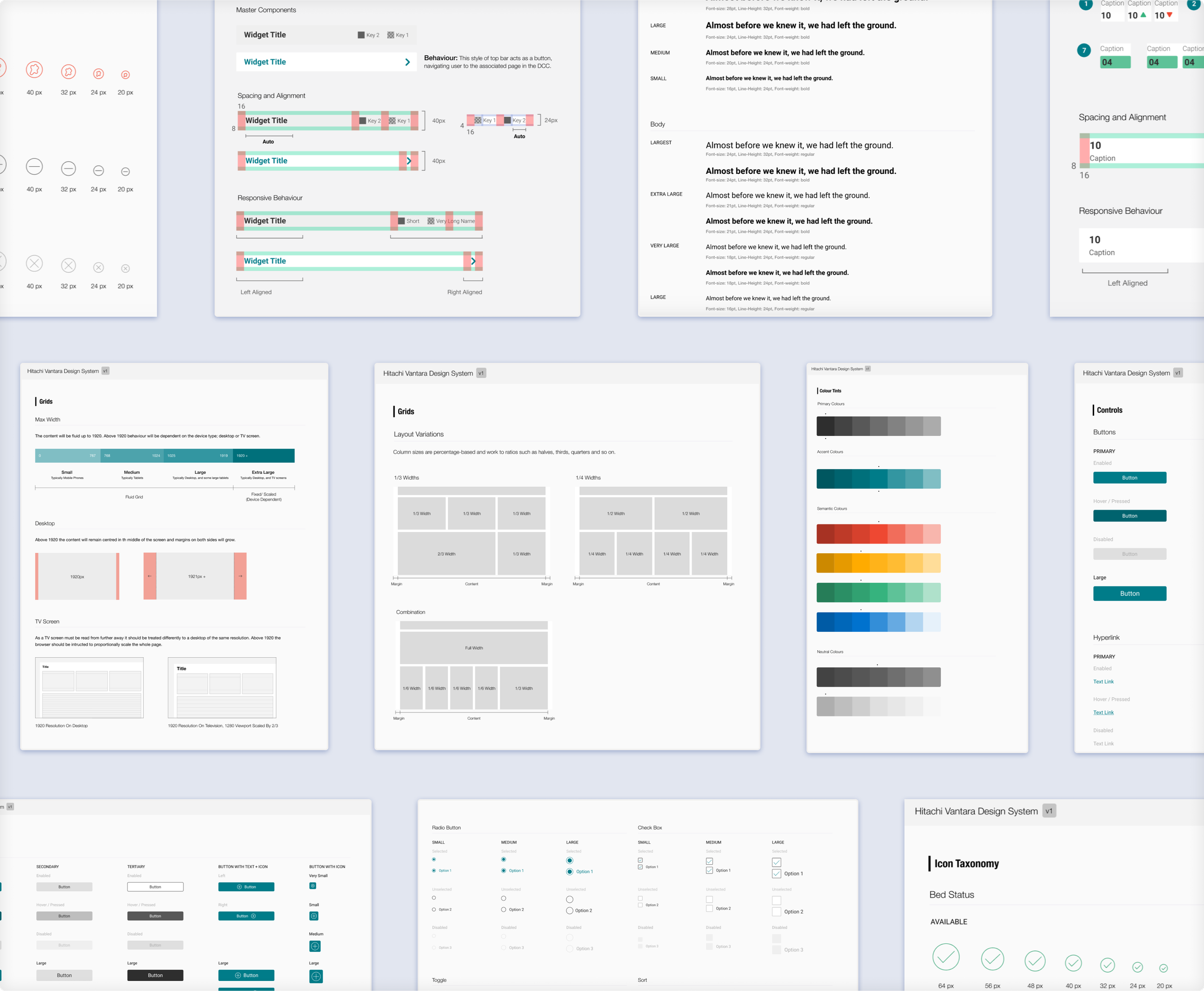
Because of the time constraints of the project, I had the opportunity to work with the UI designer to help develop a comprehensive design system
This included all design assets, such as colours, typography, icons, responsive guidelines, and interactive elements behaviour.
UI considerations
Accessibility
As an NHS-branded product, accessibility was of paramount concern.
The solution had to meet the NHS’ accessibility guidelines, which dictates that W3 WCAG standards should be adhered to wherever possible.
The Digital Control Centre’s Ecosystem
The DCC solutions must work with existing 3rd party products.
We held specific workshop sessions to learn about the use of icons and terminology used in these systems, to adopt into the DCC (where possible and appropriate) to ensure uniformity across the staff’s tools.
Impact & Outcome
Rolling out across the Northern Care Alliance
Hitachi Vantara delivered the MVP to Salford Royal in November 2020, helping the hospital to better manage its capacity with the increased number of flu and coronavirus patients through the winter.
Well done on getting approval...you are on time, under budget and exceeding expectations!
Riz Qureshi - Senior Manager, Hitachi Vantara Consulting Services
Within a few years, they hope to continue to develop the product further and see it fully integrated into the hospital’s workflow, in addition to expanding to other hospitals in the Northern Care Alliance. Metrics detailing the redesign’s success are pending. Updates are available here.
Key learnings - the realities of ‘real world’ design
The ‘real world’ design process is not linear, and the most challenging part of being a designer is adapting to the unique constraints each project creates.
During this project, we (understandably) had constraints on contact time with users due to the increasing pressure the pandemic was placing on the hospital.
This was an important experience in adapting my ‘design toolbox’ to drive for an optimal solution that holds the users at its heart, even when the ‘best practice process’ does not look achievable.
A highly rewarding project to be apart of, which really demonstrates the importance and impact of design can have on people.