
B2B Property Intelligence platform
Redesigning a fragmented data platform into a scalable product, boosting revenue by 1,229%.
Background
Reimagining the platform from the ground up
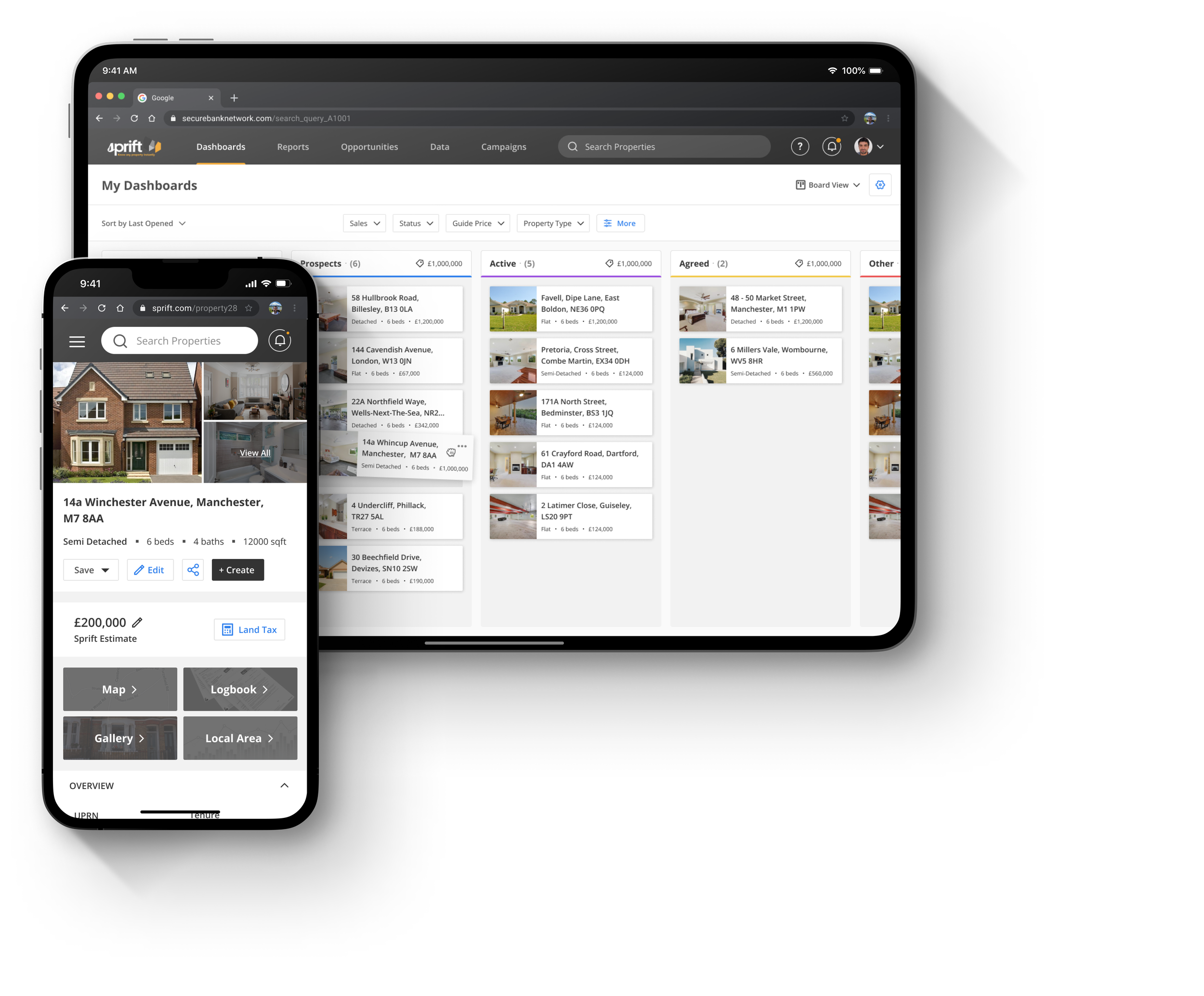
Who: Sprift's B2B platform aggregates data across 29 million UK properties, helping estate agents automate research and report creation.
Product: The product worked, the experience didn’t. Without UX input, navigation and workflows were fragmented, and the interface broke down on smaller screens. This wasn’t just a usability issue, it was blocking investment and limiting their ability to win enterprise clients.
Role: I led the redesign, working directly with Sprift's C-suite and development team.
Result: 1,229% revenue growth over three years. Named one of the UK's top 50 fastest-growing companies by Deloitte.

Defining the problem
Gathering the requirements
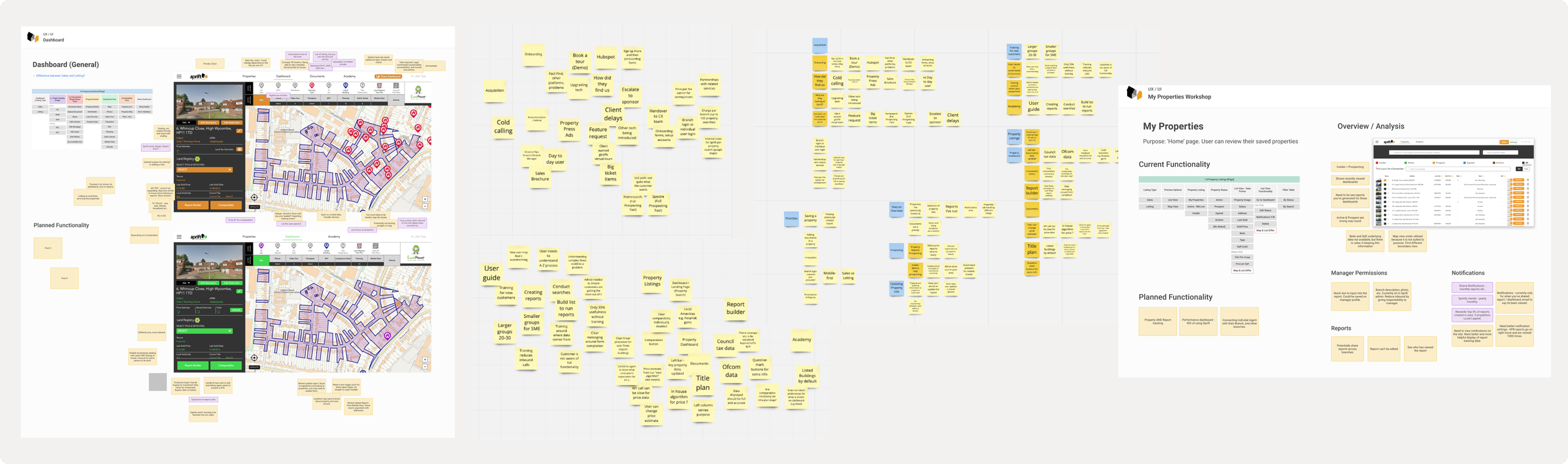
Early discovery combined stakeholder input with analysis of support logs and feature requests via the Customer Experience team.
Three critical issues emerged;
Workflows broke down under real usage
Search was only available on the dashboard, forcing users to repeatedly abandon tasks and restart.
The product didn’t support how agents actually work
Estate agents manage multiple properties simultaneously, but had no way to track or organise that pipeline.
Feature growth had no underlying structure
Features had been added without structure, making key functionality hard to find and underused.
Competitor Research
Tech Kick Off
UX Audit
Stakeholder Interviews
CX Research Workshop
User Interviews & Workshop
Establishing product direction
Engaging with feature prioritisation
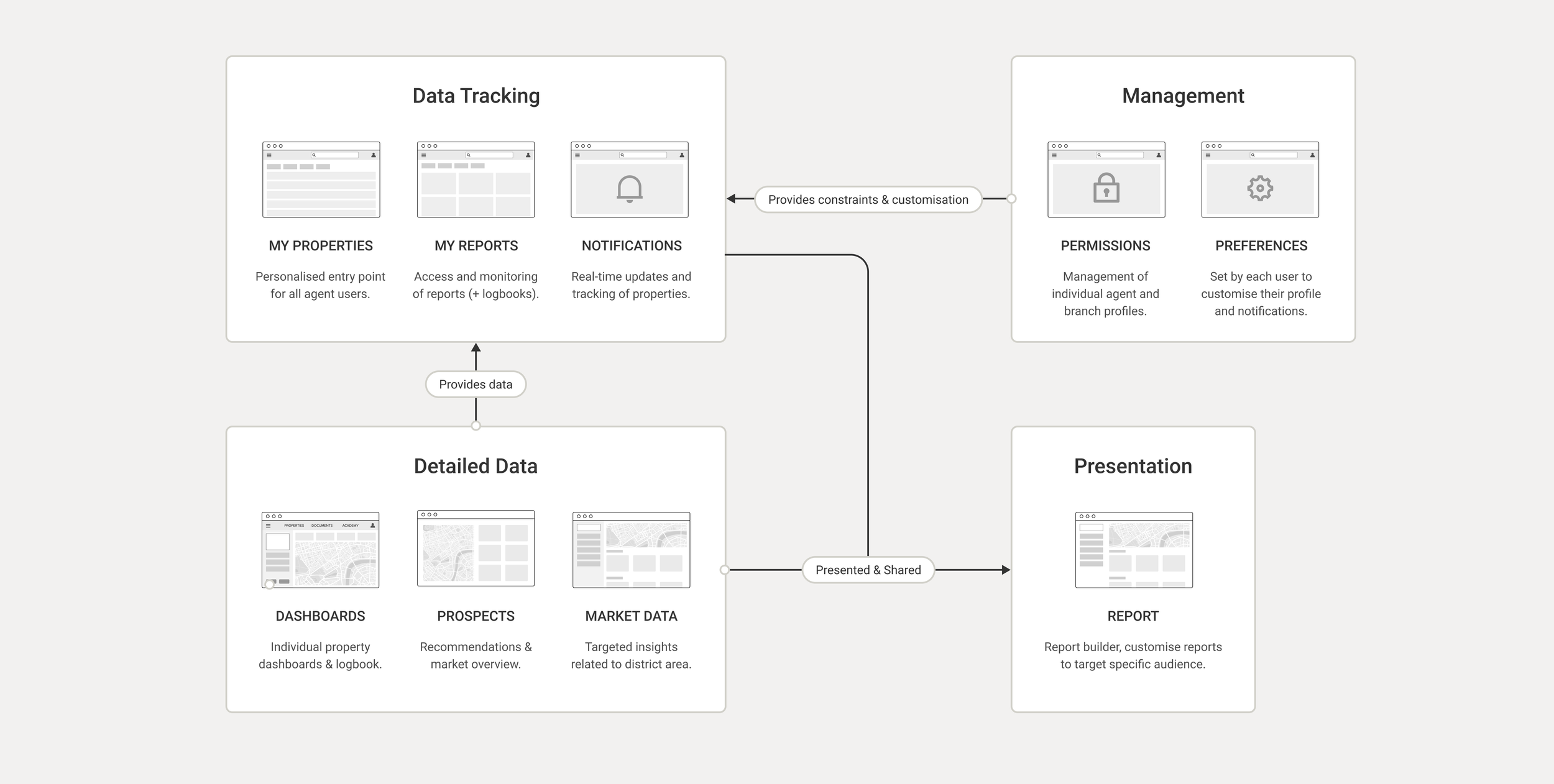
Before redesigning screens, I worked with stakeholders to define a clearer structure for the product.
We reframed the platform into three functional layers:
Tracking: monitoring saved properties and market activity
Analysis: exploring detailed property data
Presentation: generating reports for clients
This provided a shared mental model for both users and the team, and informed the new navigation and page architecture.
Driving alignment
Prioritising long-term usability over short-term features
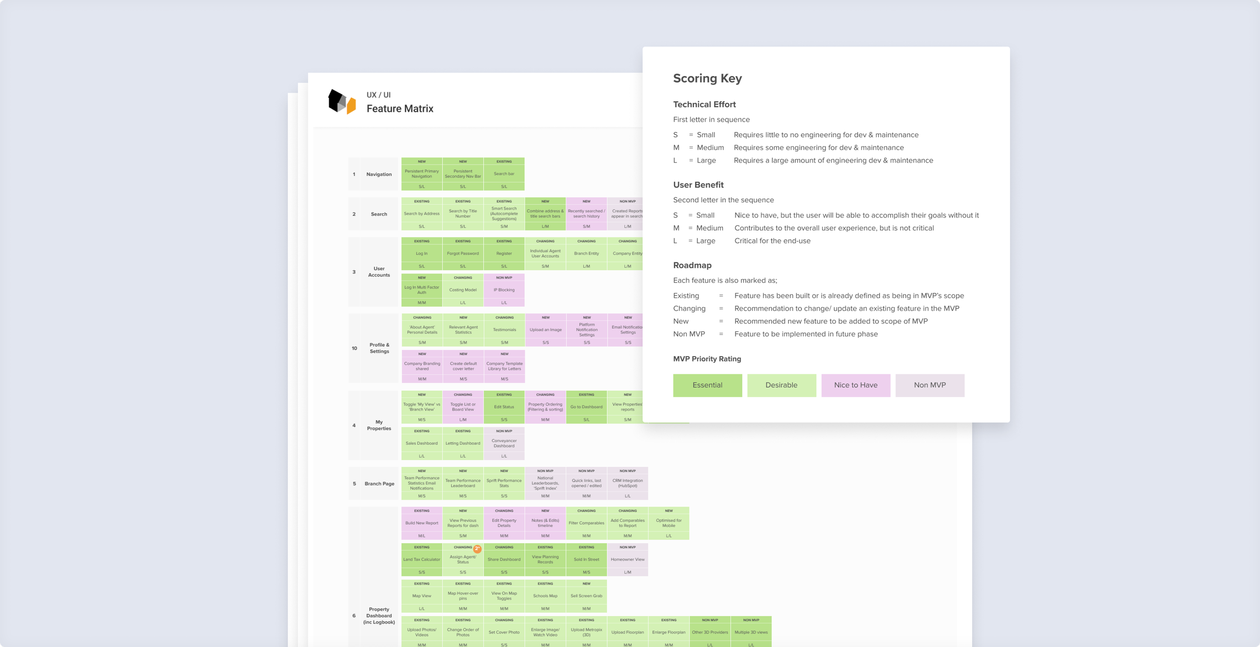
Stakeholders had competing views on what mattered most. I introduced a feature matrix balancing user value, technical feasibility, and business impact, creating a shared framework for decision-making.
To ground the discussion, I brought in the Head of Customer Experience and used support data to show where workflows were breaking down.
This surfaced a key trade-off. I aligned the team around fixing product foundations and core workflows before introducing new functionality.
The matrix became a shared reference point throughout delivery, keeping the team aligned to the agreed priorities.
Design Outcome
1 of 3 - My Properties Dashboard
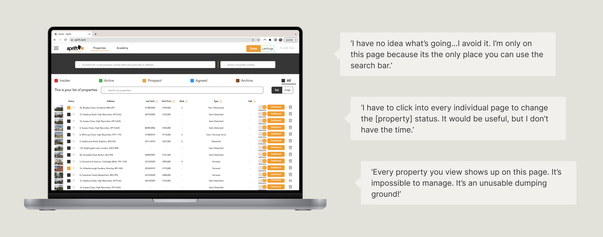
Before - the previously confusing entry point
The property dashboard is where the user lands after logging in. Previously, it was the only place on the platform where the user could use the search bar - which would see the user repeatedly returning, frustratedly, to this page during report creation.
Users wanted an easy way to find and manage the properties they are tracking and create reports from them.
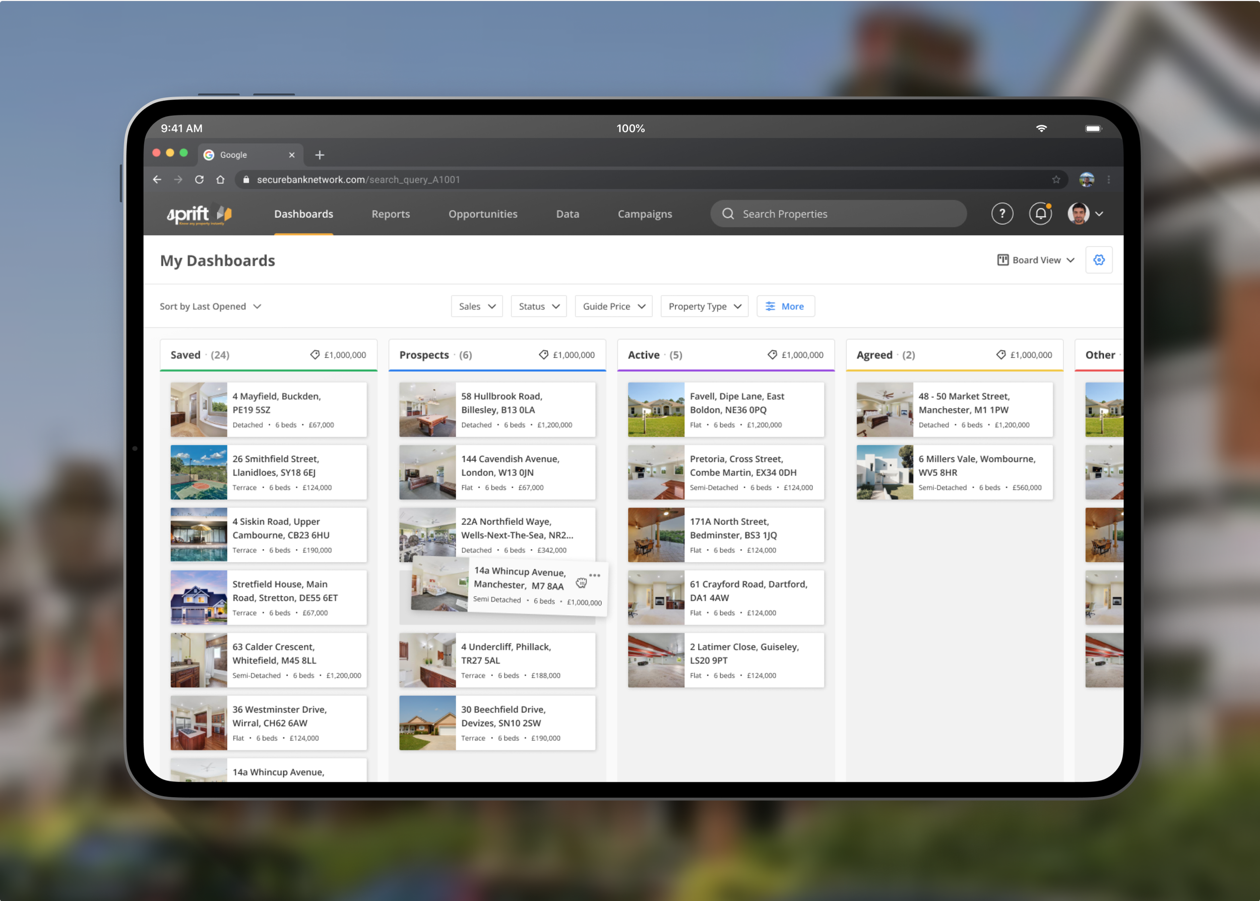
After - organisation and efficiency
Selected UX/UI Improvements
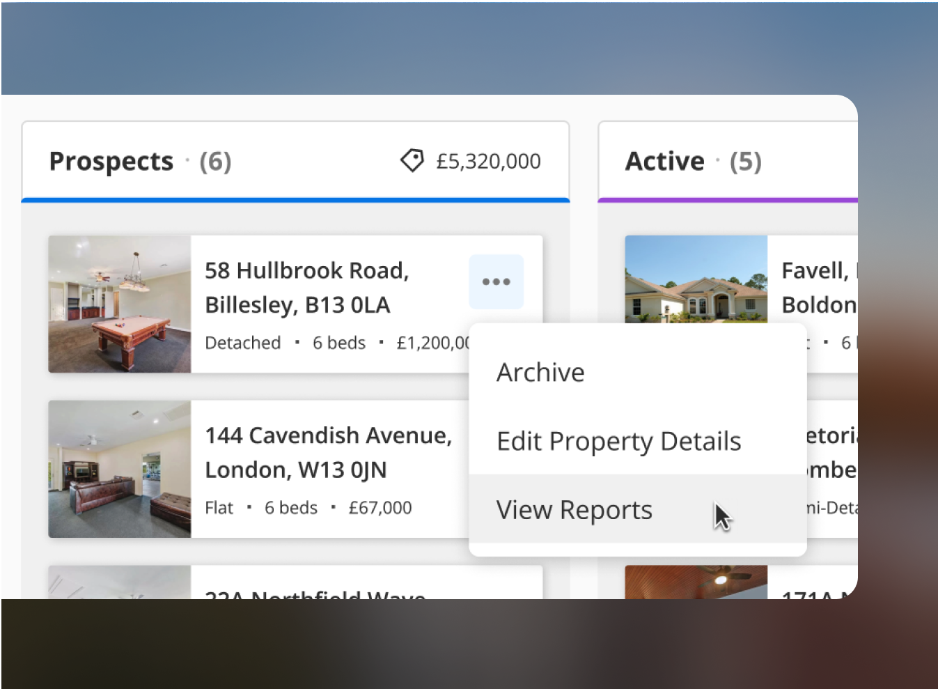
New board view
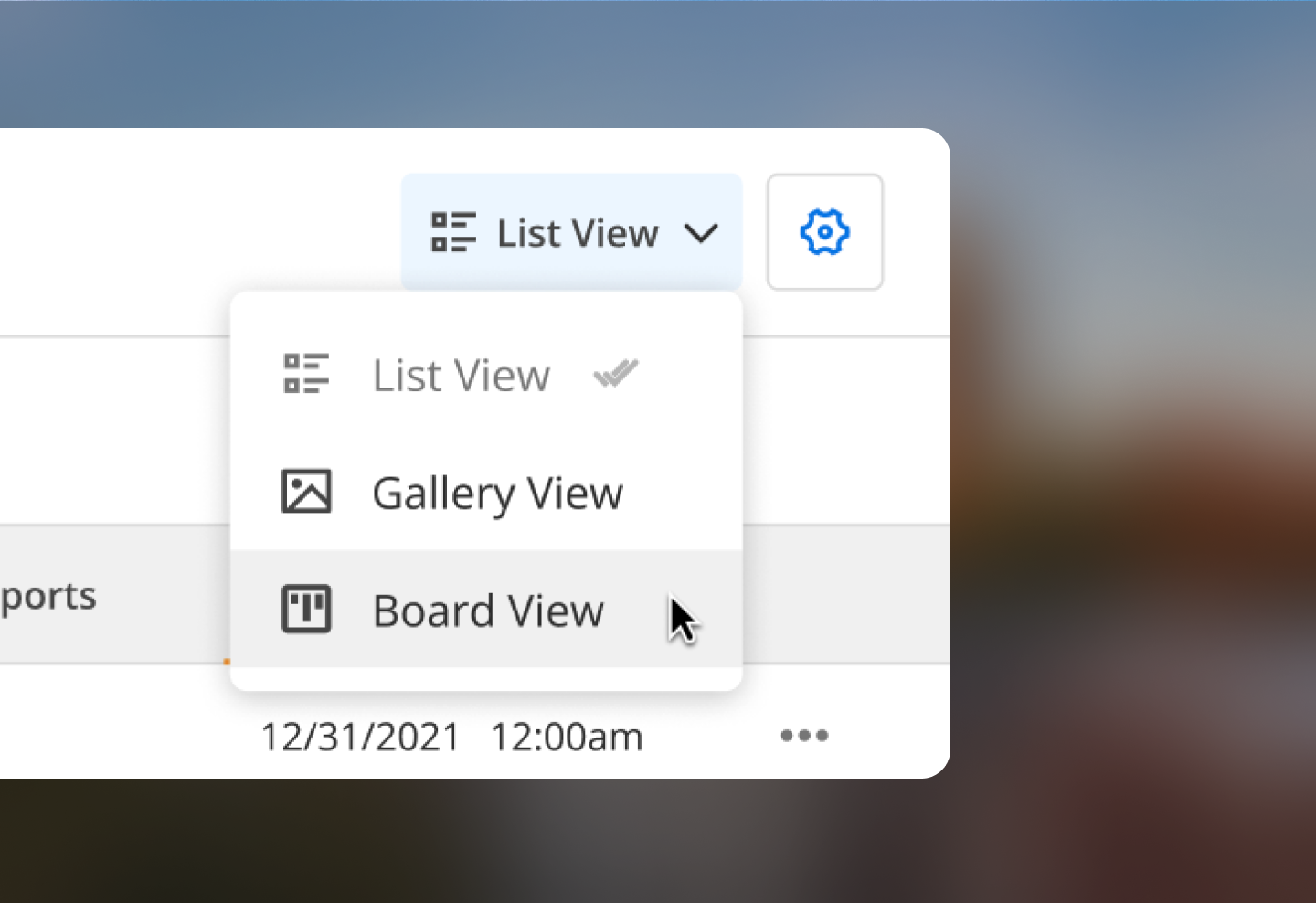
The kanban board allows the user to visualise their workflow, and move properties through the process, updating their status from ‘prospecting’ to ‘sold’, simply by clicking and dragging the card.
Beyond the first release, there will be options for personalisation (card appearance, column arrangements).

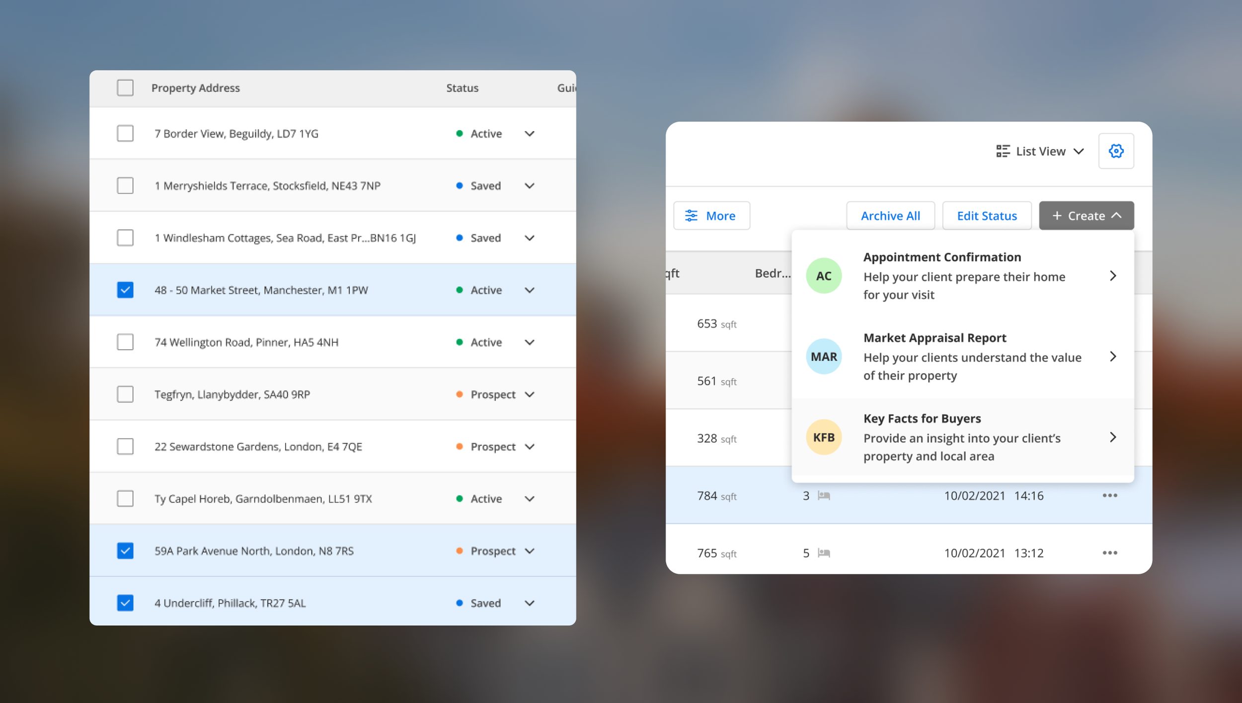
Updated table view
New sort and filter (above) to remove the workload of locating a property.
All of the user’s primary actions can be completed from this page; batch selection (below, left) allows users to make bulk edits to properties (update their status, update out-of-date information), or select multiple properties to create a report with (below, right).
Design Outcome
2 of 3 - Comparable Properties
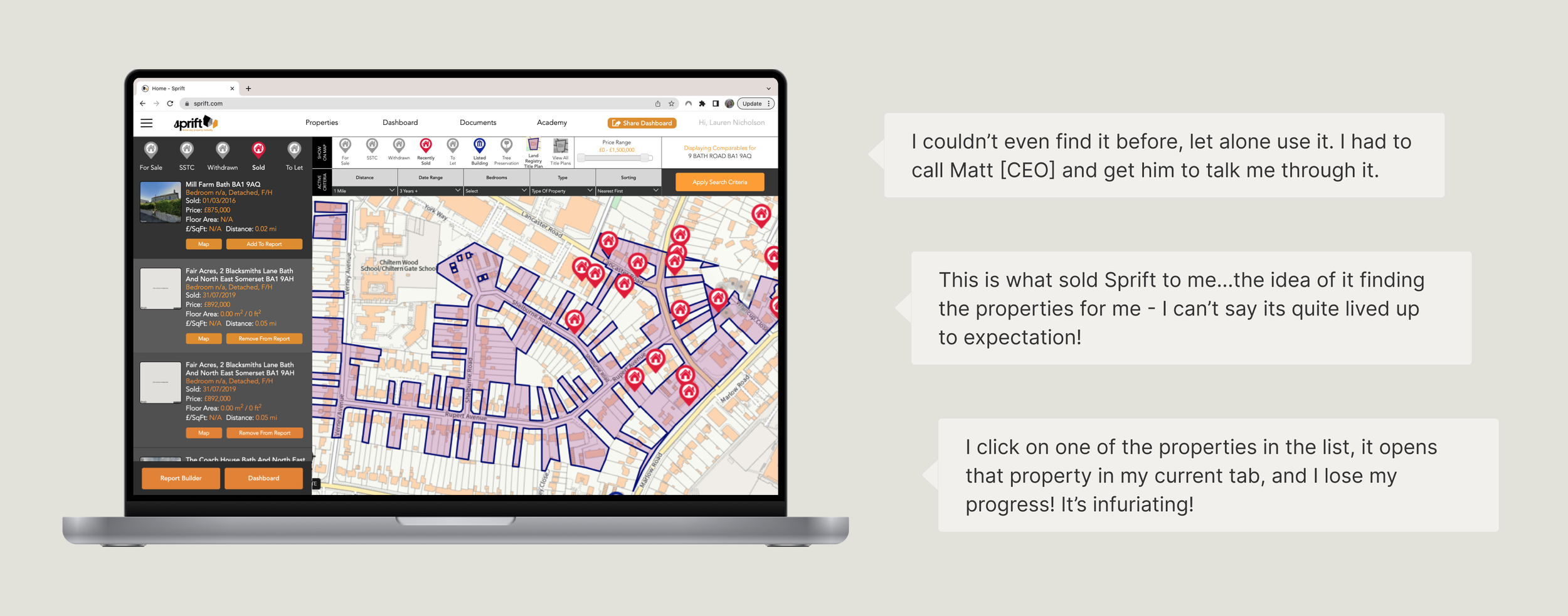
Before - user’s most loved (and most hated) feature
The ‘comparables’ feature is part of Sprift’s USP and a core user journey. The idea was for the platform to generate a list of properties comparable to the user’s current selection.
Clients loved the idea of the feature, but a confusing interface made it possible for users to lose all of their progress with a simple mis-click.
After - automating the user’s workload
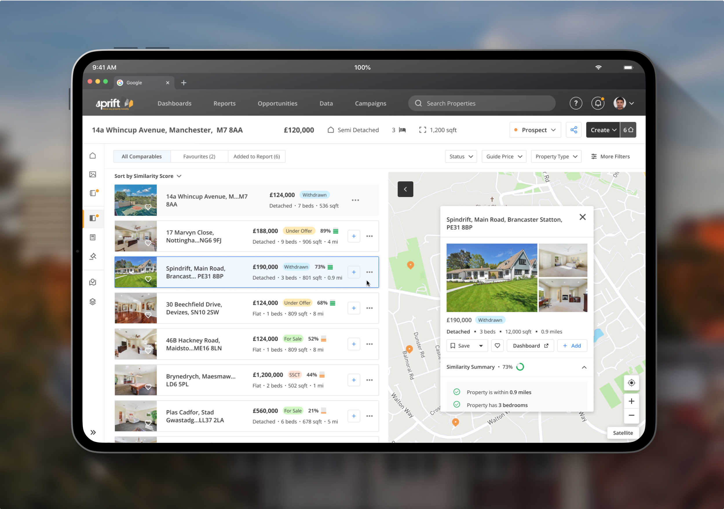
Selected UX/UI Improvements
A new map preview
The map overlay (above) allows the user to see a useful preview of a similar property without having to leave the page they are currently on. The user can assess how suitable they think a property is from the overview and manually add it to their report.
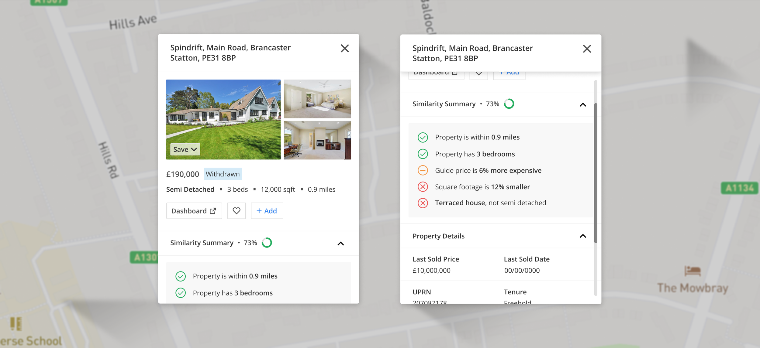
AI Similarity Score
An AI-generated similarity score, designed to enable quicker and more accurate property comparisons at a glance, making it easier to sort and filter large quantities of properties at one time.
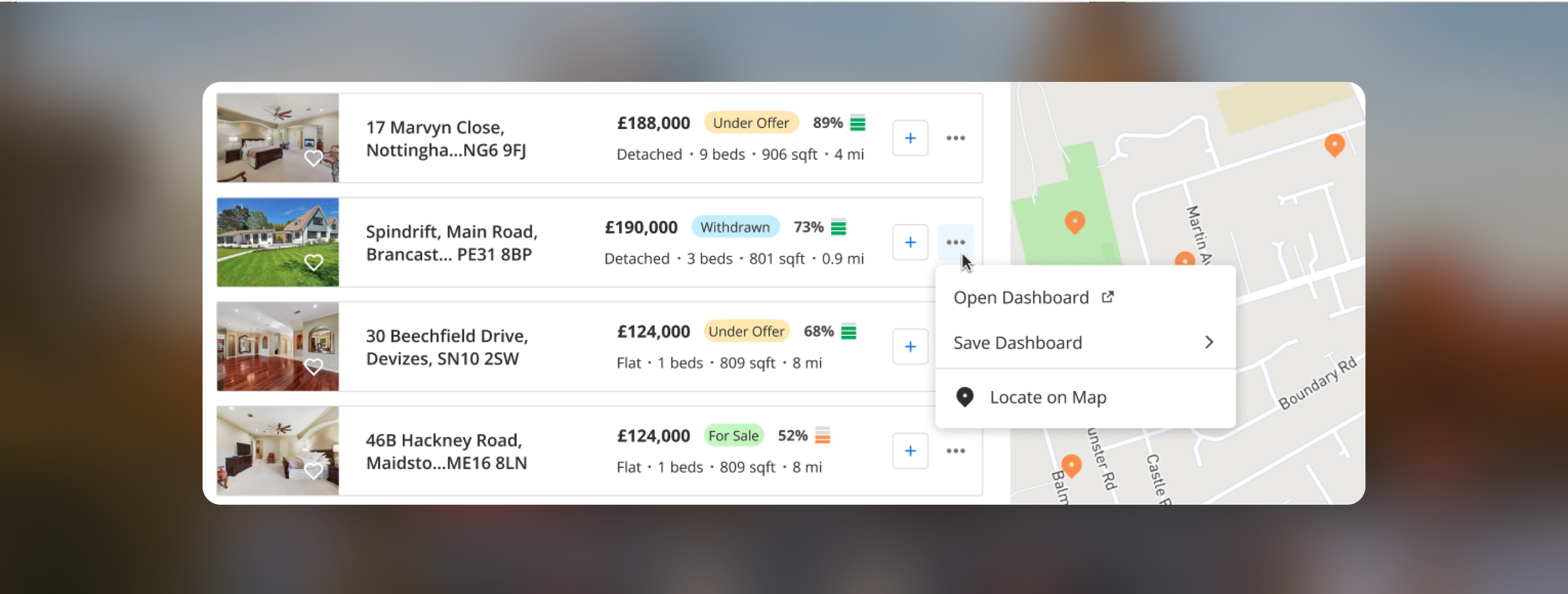
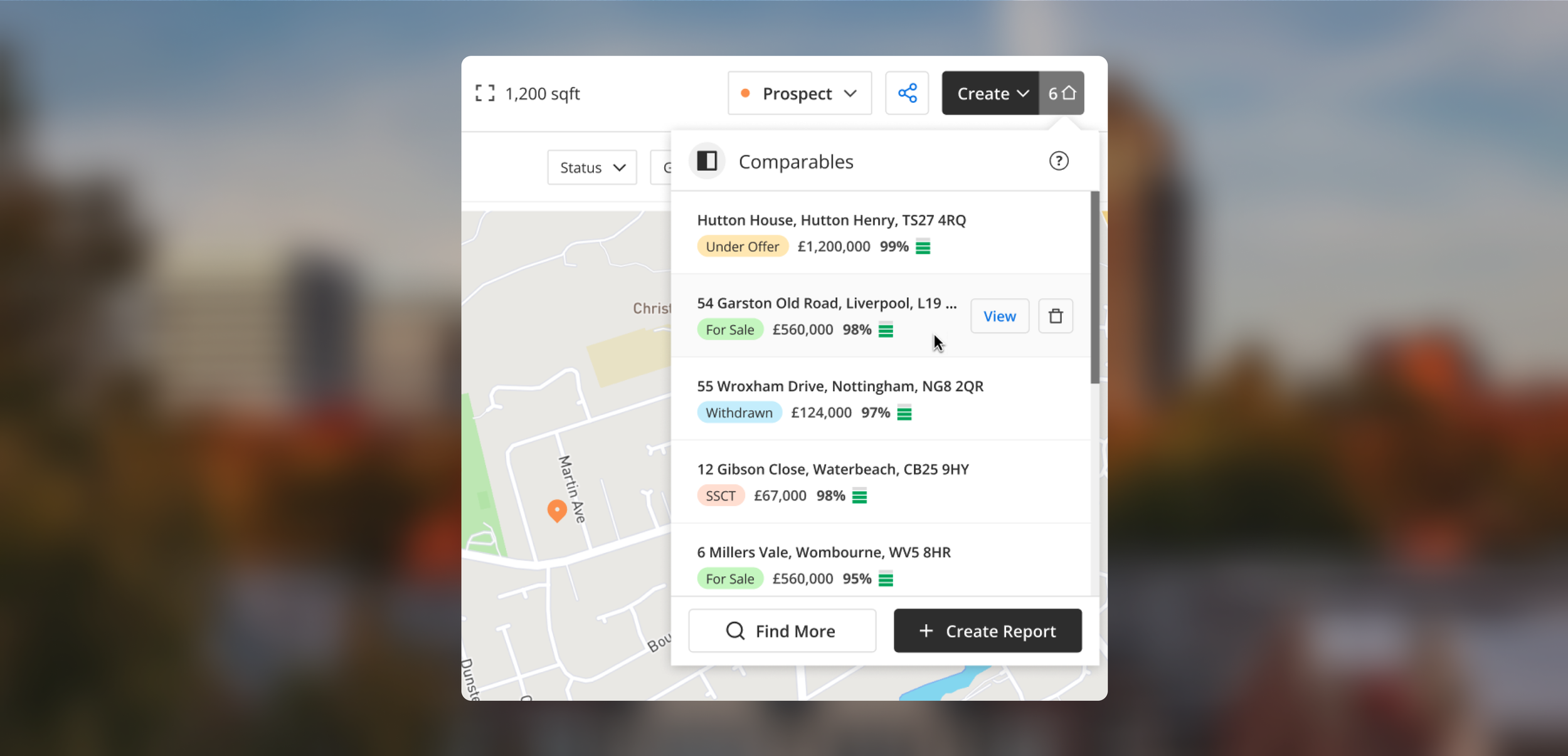
‘Add to report’ CTA
The ‘Create’ CTA remains (below) visible and accessible on the navigation bar at all times.
Once they are finished they can click ‘Create’ to automatically generate their report.
Design Outcome
3 of 3 - Property Page
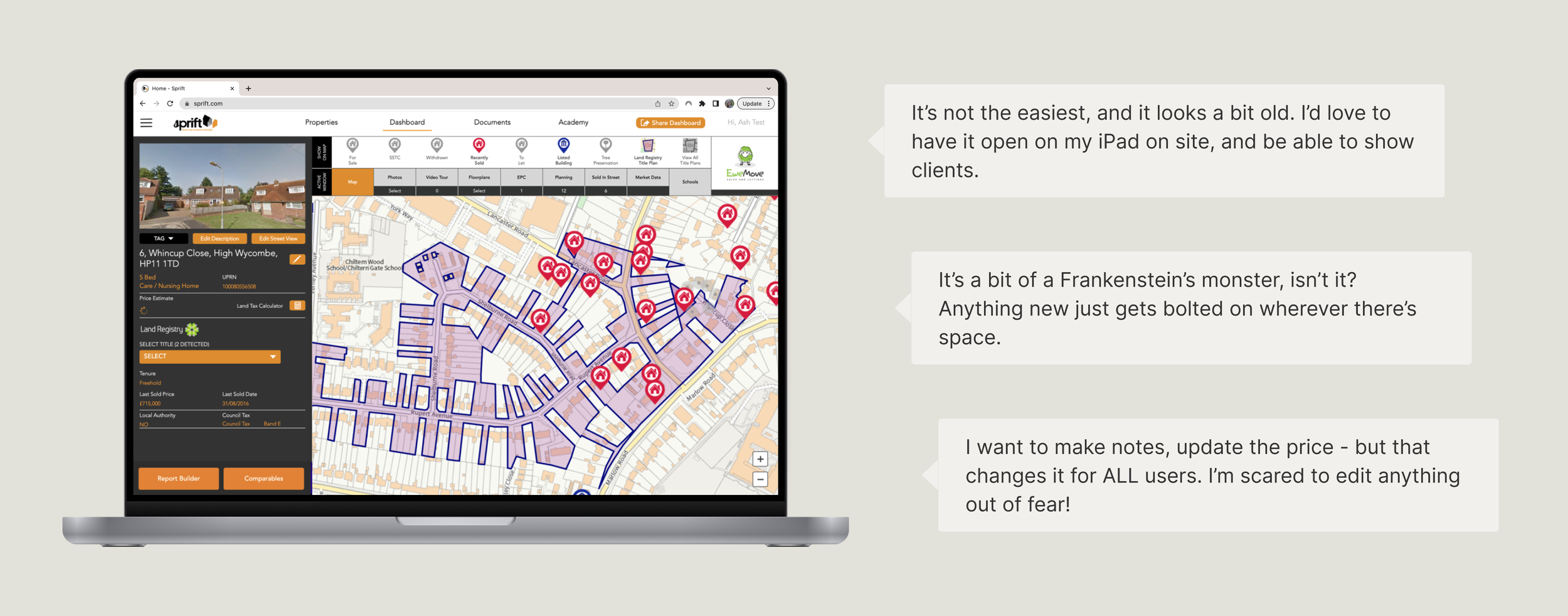
Before - ‘Frankenstein’s Monster’
The property page amalgamates all of the available data points for the property into a single dashboard.
The design had not been updated since Sprift’s conception, and new features and data were added haphazardly as they became available.
After - future-proofing for an expanding feature set
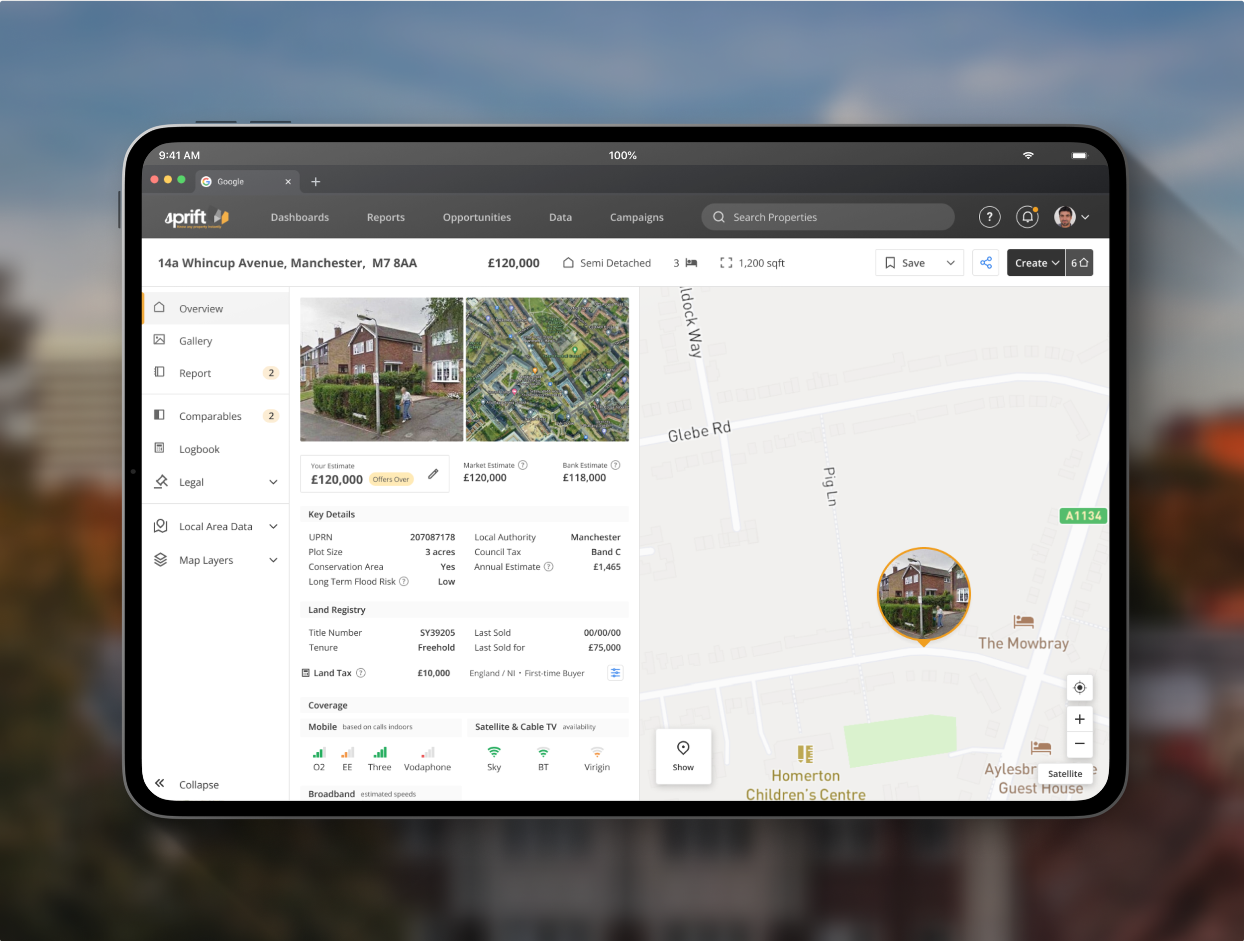
Selected UX/UI Improvements
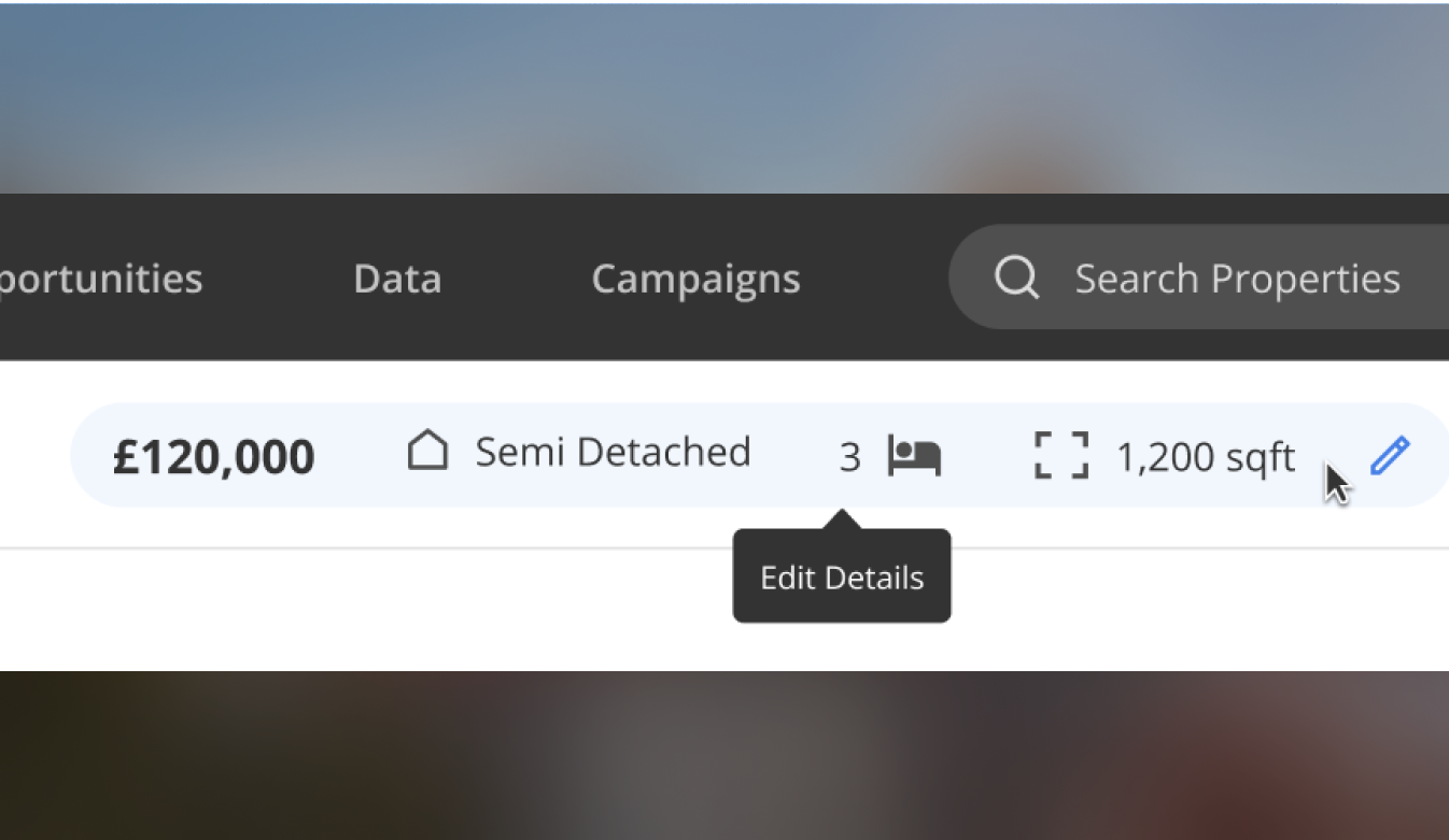
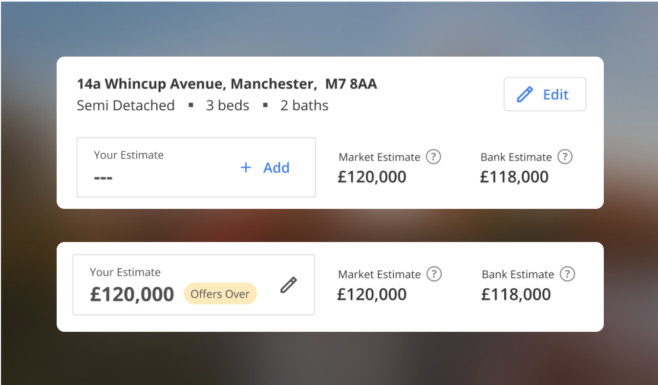
Edit details and add a price evaluation
The user can suggest changes to incorrect property data (left). Other users with the property saved will be able to verify that the information is correct.
New feature (right) where the user can privately update a competitive price to appear in their reports to clients, without their competitors (other users) seeing and without overwriting the market and bank estimates.
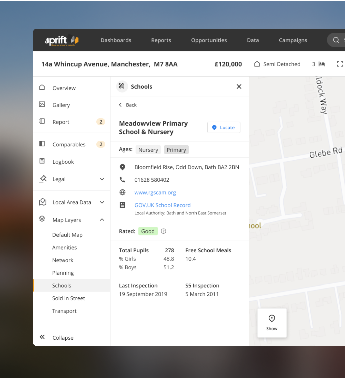
Future-proofing the design
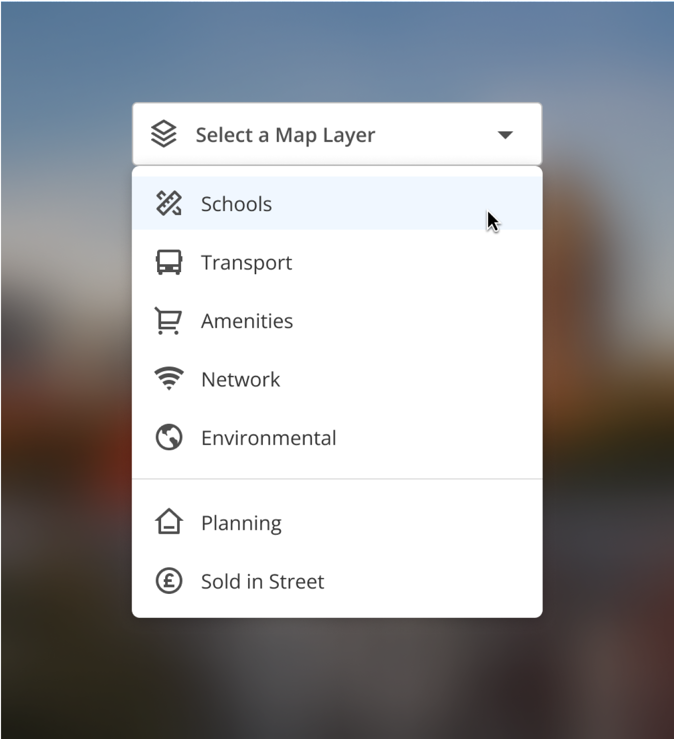
As part of the navigation overhaul, I considered the platform's scalability and created flexible navigation designs to accommodate an increasing number of navigation items.
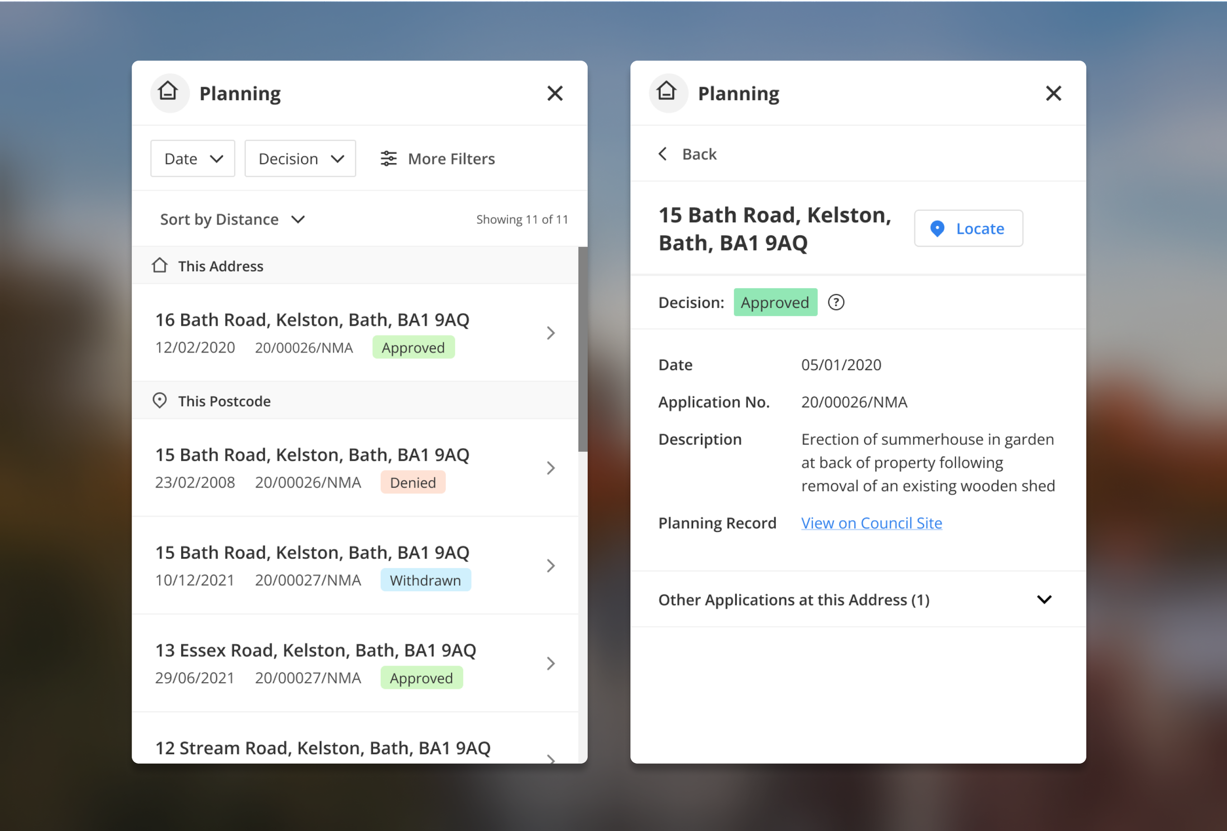
I developed templates for the map layers (above), enabling the development team to build usable and beautiful interfaces from reusable blocks, even without additional design assistance. Examples shown: schools and planning.
User Feedback
Final feedback in a user workshop
Semi-structured, we walked through clickable prototypes on screen share. User feedback was overwhelmingly positive;
✔️ ‘This is great. I really feel like you’ve listened. I can’t wait for the update.’
✔️ ‘I’m going to be able to find everything so much faster now. I’ll be able to stop annoying Matt! [CEO]’
✔️ ‘It all just looks so much cleaner and easier to use…far more cohesive. I’m really excited to try it.’
All users considered the new design to be an improvement. All users were able to correctly discuss how they would complete key tasks on the new interface. Users were most enthusiastic about the new, consistent, navigation and search bar.
Establishing design foundations
Crafting a white label solution
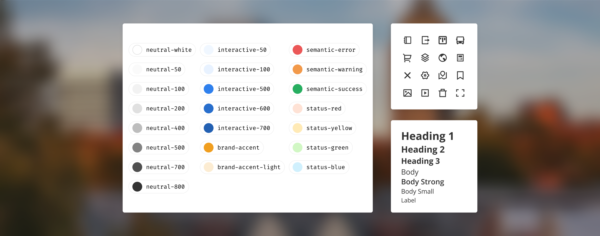
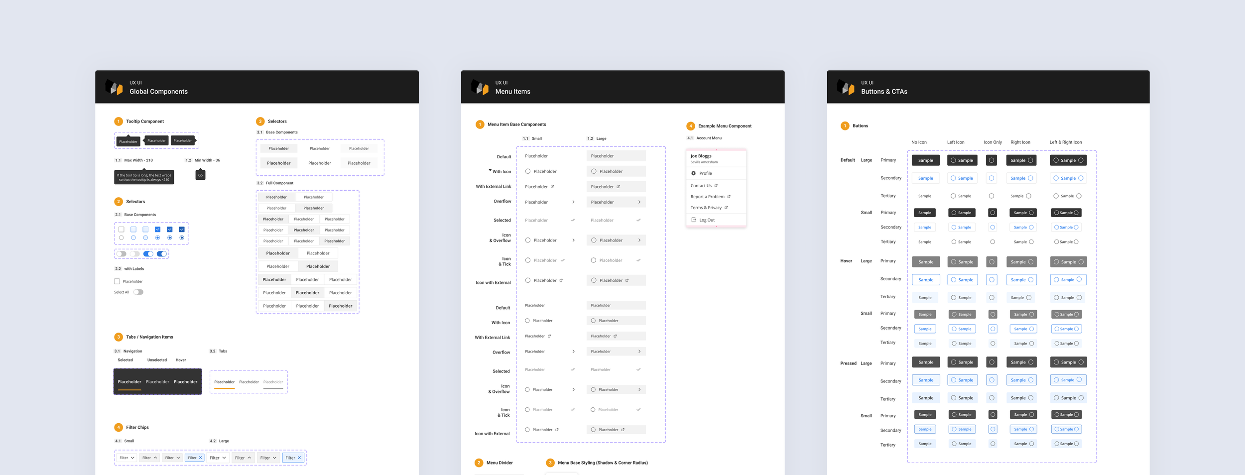
Development had previously relied on written specs and occasional InDesign files. I partnered with the Lead Engineer to introduce the platform’s first design system, focusing on;
Defining reusable components and aligning to newly implemented Storybook
Establishing a consistent design-to-development workflow using Figma
Minimising bespoke components to speed up delivery and maintainability
Enabling client customisation through a white-label framework
This created a scalable foundation and enabled the team to build more consistently and efficiently without ongoing design input.
Impact & Outcome
A market leading platform in the making
‘I was genuinely very happy with all they did...they cared about the company and the project, evident in how they handled the entire redesigning process.’
Ash Sheikh, Head of Development
Post-launch, Sprift signed their largest clients to date and won Best Use of Big Data at the Go:Tech Awards.
In the three years following the redesign Sprift achieved 1,229% revenue growth and recognition from Deloitte as one of the top 50 fastest-growing UK companies.


Learnings
Demonstrating value > lecturing theory
Sprift were initially sceptical of the need for discovery activities, and were highly reluctant to involve users directly. To work around this, I ran a workshop with their Customer Experience team instead; their helpline logs and feature request backlog were a direct record of where users were struggling.
Demonstrating the value of user insight quietly, rather than pushing for access, was ultimately what opened the door to direct user involvement and testing later in the project. Sprift weren’t looking to learn why UX principles mattered in theory, they needed to see it produce something useful.